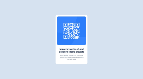
Submitted over 2 years agoA solution to the QR code component challenge
Responsive QR Code Component Solution Using CSS Flexbox Layout Module
gulp, node, sass/scss, accessibility

@kanishkasubash
Solution retrospective
Hi! 👋, Frontend Friends.
I've just completed my first front-end coding challenge. This is my solution for the QR Code Component.
🛠️ Built With:
- Semantic HTML5 markup
- SASS/SCSS
- Node.JS
- GULP.JS
- Mobile First Approach
📦Features:
- Responsiveness (Mobile/Tab/Laptop/Desktop).
🔖What I am learned:
- Level Up SCSS
- CSS Flexbox & Grid. Link
❓Questions for the community:
- I have a question about best practices. Is the Flexbox best layout module to design flexible responsive layout structure?
💡Any suggestions on how I can improve are welcome!
😊I'll be happy to hear any feedback and advice! Thank you.
Code
Loading...
Please log in to post a comment
Log in with GitHubCommunity feedback
No feedback yet. Be the first to give feedback on Kanishka Priyashantha's solution.
Join our Discord community
Join thousands of Frontend Mentor community members taking the challenges, sharing resources, helping each other, and chatting about all things front-end!
Join our Discord