Not Found
Not Found
Not Found
Not Found
Not Found
Not Found
Not Found
Not Found
Not Found
Not Found
Not Found
Not Found
Not Found
Not Found
Not Found
Not Found
Not Found
Not Found
Not Found
Not Found

Submitted

Responsive sign up form

Andrey 180

@ANDyouNo

Desktop design screenshot for the Newsletter sign-up form with success message coding challenge

This is a solution for...

  • HTML
  • CSS
  • JS
2junior
View challenge

Design comparison


SolutionDesign

Solution retrospective


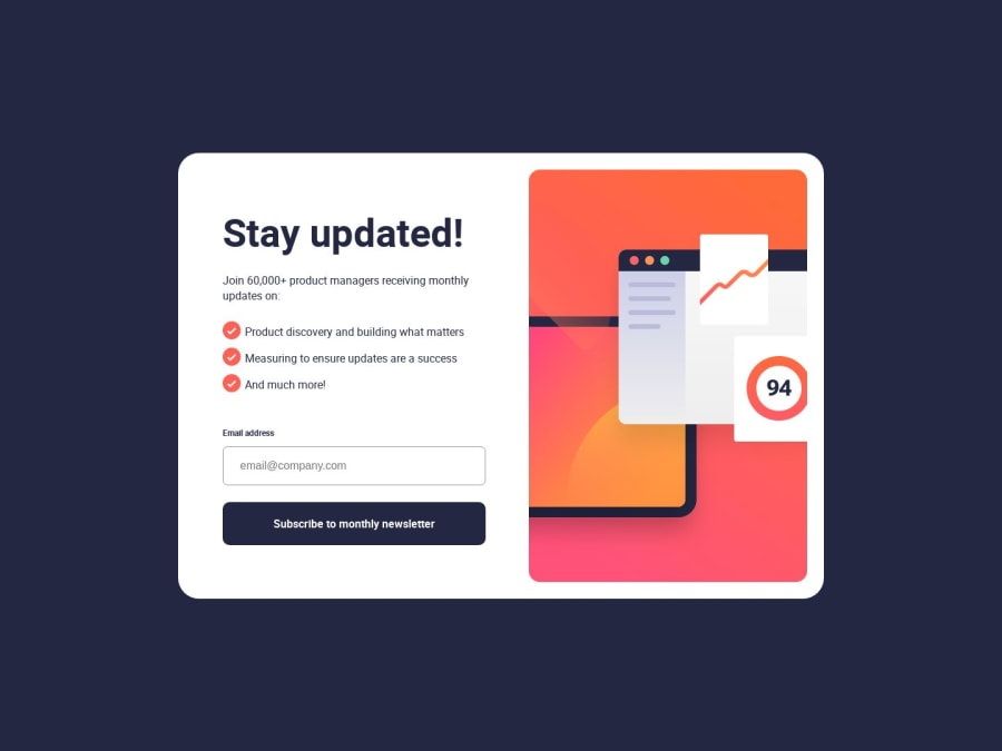
Hello everyone, Here is YouNo. It's my first splash into SCSS. Please feel free to share any suggestions or comments you may have. <3

Community feedback

@asbhogal

Posted

Hi there,

Good work! The designs match the mockup nicely. Just a few things I thought worth mentioning:

  • You might want to review your JS code. When I enter in incomplete, invalid or correct email addresses, the page re-renders, so as a user it's unclear which are submitted (only the last should be) and the error messages don't show.
  • Also, try and keep your variables descriptive enough to understand - avoid condensing them to inp and errMsg as well as typos (succesCard) as it can become difficult for developers to debug and identify their purpose especially as code scales
  • It's best to have your font-size as rem values for accessibility purposes. Here's a good link from freeCodeCamp explaining this in further detail Link
  • Locally host your Google Fonts for privacy and performance. You can download them from the website, convert them to woff2 format then upload and reference them in your stylesheets. This video by Kevin Powell explains this process in further detail Link
  • Avoid setting an explicit width value to parent containers as these can cause overflow issues with viewport width changes. It's best to have a max-width with a specified value and a width: 100% so the content either occupies the full available space on viewports less than the max-width or the maximum it can based on the max-width value
  • From a maintenance perspective, split your stylesheet into separate partials for easier location and reduced cognitive load (e.g. having a variables.scss, a responsive.scss, a typography.scss etc.)

Hope this helps!

Marked as helpful

1

Andrey 180

@ANDyouNo

Posted

@asbhogal, thanks a lot for your feedback, I will try to correct these shortcomings in my future projects

0

@asbhogal

Posted

@ANDyouNo no problem at all, glad to help! I would highly recommend however changing the current project with these suggestions, as iterating over and making amendments based on feedback is a common practice in software development. You also learn a lot too. Hope this helps.

0
Andrey 180

@ANDyouNo

Posted

I tried to correct the shortcomings in this project, except for paragraph with width. I want to try the method with the calculation of values relative to viewport. It looks like calc(1vh + 1vw) and add to this coefficients.

0

Please log in to post a comment

Log in with GitHub
Discord logo

Join our Discord community

Join thousands of Frontend Mentor community members taking the challenges, sharing resources, helping each other, and chatting about all things front-end!

Join our Discord