Yazdun
@YazdunAll solutions
- Submitted almost 2 years ago
Dictionary web application
#accessibility#framer-motion#react#tailwind-css- HTML
- CSS
- JS
- API
- Submitted over 2 years ago
Animated landing page using framer motion and LottieFiles
#framer-motion#react#tailwind-css- HTML
- CSS
- JS
- Submitted over 2 years ago
audiophile solution built with Next + Typescript
#next#react#typescript#framer-motion- HTML
- CSS
- JS
- Submitted over 2 years ago
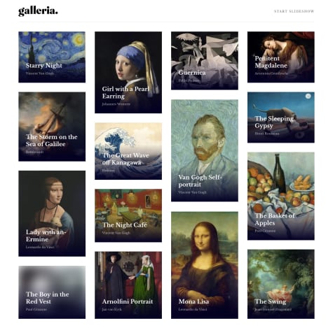
Galleria | Next and Typescript
#framer-motion#next#react#typescript#react-testing-library- HTML
- CSS
- JS
- Submitted over 2 years ago
Planet facts | React and Framer motion
#framer-motion#react#accessibility- HTML
- CSS
- JS
- Submitted almost 3 years ago
full stack interactive comments
#accessibility#express#next#react#mongodb- HTML
- CSS
- JS
- Submitted about 3 years ago
Stats preview card component 🌞 Light-mode / Dark-mode toggle feature
- HTML
- CSS