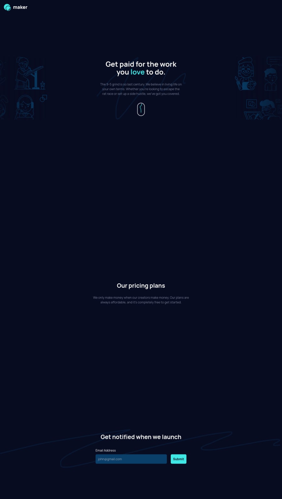
Animated landing page using framer motion and LottieFiles
Design comparison
Solution retrospective
Hello everyone 👋 I picked up this challenge to play around with Tailwind and I actually fell in love with it !
I created a modal for form submit with some cool Lottie animation, so make sure to submit an email to see the modal 😁
I'm looking forward to hear some feedbacks on this, Thanks in advance.
Community feedback
- P@grifanoPosted over 2 years ago
Hi, man great work. I noticed some small issues on Safari. When the animation was complete, there is some extra space was appear, the whole container was stitched, and the content aligned slightly to the left. Maybe overflow hidden could help?
Marked as helpful0@YazdunPosted over 2 years ago@Grifano Hey man thank you so much for your feedback 🥰 I ran the website on my friend's mac right now and we didn't notice any issues, but I did some more adjustments anyway. It would be so kind of you if run the website again and tell me if the problem is still there, since I don't have access to safari myself 😖
0@hokuto-katoPosted over 2 years ago@Yazdun Great work!!! I checked it in safari. I thought it was perfect except for the part where the mouse shows up really big! https://postimg.cc/PPG7CQcf
Marked as helpful0@YazdunPosted over 2 years ago@hokuto-kato Hi Hokuto thanks for your feedback ! I added a max width to the scroll icon so I believe it won't look that big anymore 😀
Let me know what you think about it now 🙏
0P@grifanoPosted over 2 years ago@Yazdun Oh, I'm so sorry! I now focusing on Webflow, and didn’t look here. I just checked, and it seems like overflow: hidden to the div id="root" will fix the problem. I hope my help is still valuable to you 🥹
0
Please log in to post a comment
Log in with GitHubJoin our Discord community
Join thousands of Frontend Mentor community members taking the challenges, sharing resources, helping each other, and chatting about all things front-end!
Join our Discord
