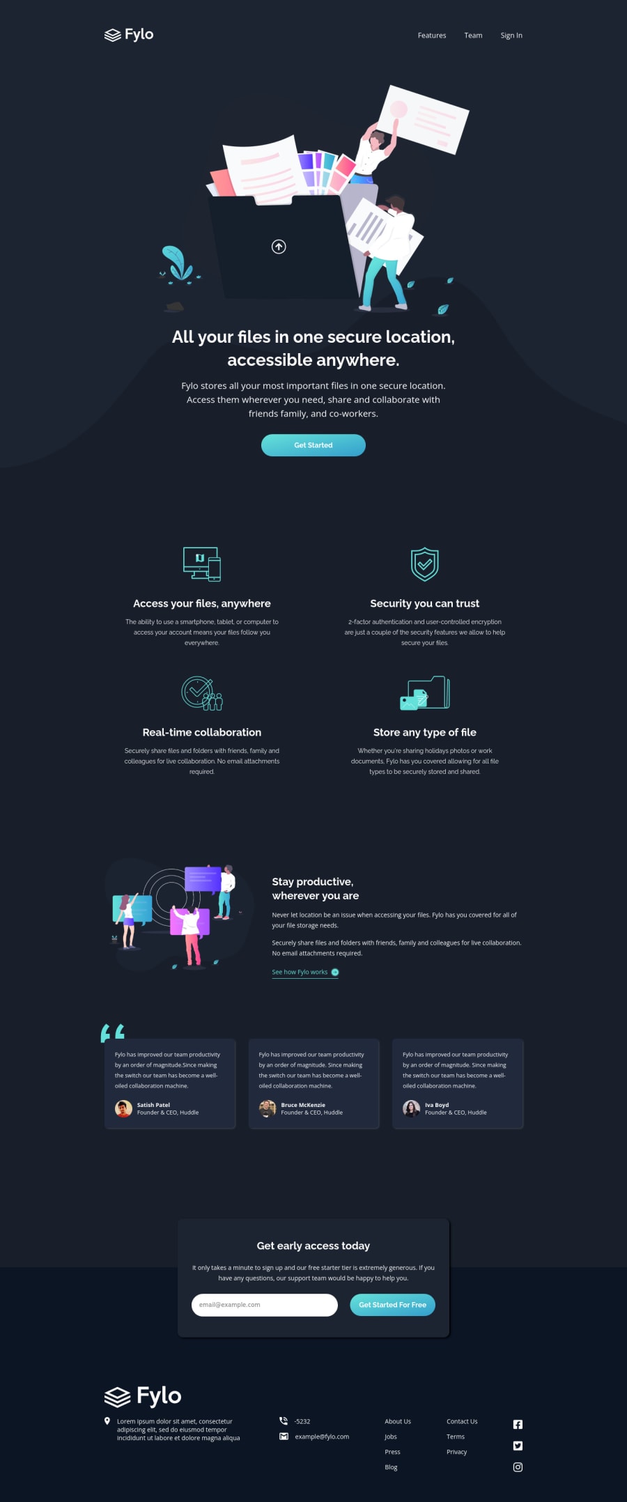
Design comparison
Solution retrospective
this challenge has a great color scheme 🔥 I used plain css and some vanilla javascript to get this done, I'll be happy to know what you think about my solution
Community feedback
- Account deleted
Hi there 👋
Congratulate on finishing your project 🎉. You did a great job 💡 I like your animation, especially the wave one 🌊
I give some suggestions to help you take your project design to the next level 📈😉
- The heading like
h1orh2should have a bigger font size, use 2.4rem to increase it 👍 - Cards in your
.quotessection should have some box-shadow
Happy coding ☕
Maqsud
Marked as helpful0@YazdunPosted almost 3 years ago@maqsudtolipov Hello Maqsud and thanks for your feedback ❤️ I increased the font size as you said, and also added box shadow which I forgot to do 😄 ! Thanks again
0Account deleted@Yazdun I'm happy to help and just a fun fact: when I see someone's project 90% of the time they forget the box-shadow so don't worry about that 😉😁
Marked as helpful0 - The heading like
- Account deleted
Hi Yazdun,
i see you have fixed the issues i mentioned and then replied ,
-
you were using heading yes but were not increasing them by one you used first h2 then h3 instead heading must increase by one and you have fixed it already
-
all images doesn't need alt texts == alt attribute and yes they can be left alone and you have fixed it already
-
all objects need alt text and you have fixed already for more info check https://dequeuniversity.com/rules/axe/4.1/object-alt#:~:text=The%20object%20element%20defines%20an,the%20contents%20of%20the%20object.
-
you replied after fixing all the issues i mentioned and then you came and say i misguide people idk why are you saying that but all of the solution i provided are for screen readers and they are right you can read about accessbility here .. https://developer.mozilla.org/en-US/docs/Learn/Accessibility/What_is_accessibility
-
the issues i mentioned are for screen readers
-
if you don't accept criticism don't ask for feedback we are here to help each other and improve no one is better than someone.
-
if my solution wasn't helpful for you why have you fixed all the issues i mentioned then?
0@YazdunPosted almost 3 years ago@Old1337 issues are fixed but not thanks to you, I didn't add any alt text to images but guess what ! there is no accessibility issue without them ! adding alt text to decorative images is not recommended. h1 headings were not even an issue in the report, you can even check my commit history on github, h1 headings were fine ! don't misguide people for stupid mark points.
I love to get criticism and feedbacks, but not some copy paste feedback to just get the mark points, you clearly didn't even check the source code to know what the issues were !
0Account deleted@Yazdun
so you are saying you have fixed all the issues i mentioned and no thanks to me then you are saying i misguide people for stupid helpful points, alright mate cheers
0@YazdunPosted almost 3 years ago@Old1337 things you mentioned were not the accessibility issues, they were beg for mark points, cheers !
0 -
- Account deleted
Hello there! 👋
Congratulations on finishing your challenge! 🎉
I have some feedback on this solution:
-
Consider using the h1 element as a top-level heading only (all h1 elements are treated as top-level headings by many screen readers and other tools) like for example use h1 first then h2 etc.
-
All Images must have alternate text
-
<object> elements must have alternate text
if my solution has helped you do not forget to mark this as helpful!
0@YazdunPosted almost 3 years ago@Old1337 Hello !
- first ! this solution already had h1 heading and that wasn't even an issue !
- second ! NO ! all images doesn't need alt texts, they need
altattribute but they can be decorative so you shouldn't add alt text to every image. you can leave alt attribute empty and that's totally fine ! - third ! NO ! all objects doesn't need alt texts for the same reason I mentioned for the image.
You can only ask for mark this as helpful and there is no need to misguide people, you can at least check the source code for a minute or so and then leave a feedback, I'm sorry but this is not helpful, but your feedback is completely nonsense
0 -
Please log in to post a comment
Log in with GitHubJoin our Discord community
Join thousands of Frontend Mentor community members taking the challenges, sharing resources, helping each other, and chatting about all things front-end!
Join our Discord
