full stack interactive comments
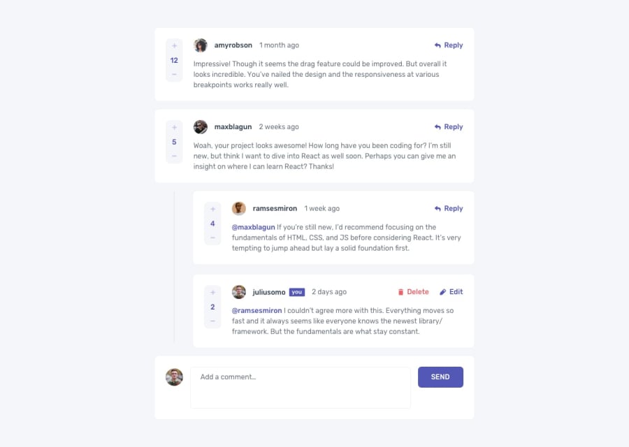
Design comparison
Solution retrospective
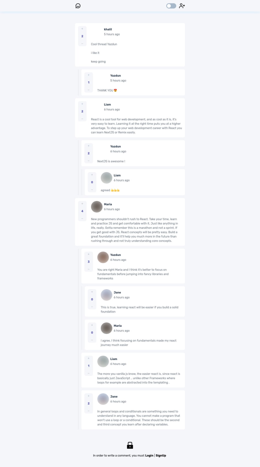
Hey everybody, I finished this challenge using Next.js, also I built an API for this challenge which you can check that out too, I'm looking forward to hear about your feedbacks and thoughts on this solution
Community feedback
- @vanzasetiaPosted almost 3 years ago
Excellent work on this challenge, Yazdun! Your solution looks great! 👏 The transitions on the site obey the
prefers-reduced-motionuser preference! 👍I notice there's a
htmltag below the<div id="__next" reactroot>. I don't understand Next.js so I can't give you any solution to this problem. 😅Also, about the alternative text for the avatar, it would be better if the alternative text is Yazdun - Viking so that the user knows that it's you and you are using the Viking avatar. I think the same as adding the word image or any words that related to it could be verbose because the screen reader is already pronounced it as an image.
I hope this information is useful! Keep up the excellent work! 👍
Marked as helpful0@YazdunPosted almost 3 years ago@vanzasetia Hi Vanza, Thanks for your feedback
I actually wasn't aware of
htmlissue before you mentioned it, I was using thehtmltag in a wrong place, now I fixed it thanks for finding the issue 🙏Also I think your suggestion about avatar alternative text makes more sense, so I changed that too 👍
1@vanzasetiaPosted almost 3 years ago@Yazdun Great job with the update! Keep it up, Yazdun! 👍
1
Please log in to post a comment
Log in with GitHubJoin our Discord community
Join thousands of Frontend Mentor community members taking the challenges, sharing resources, helping each other, and chatting about all things front-end!
Join our Discord
