Design comparison
Solution retrospective
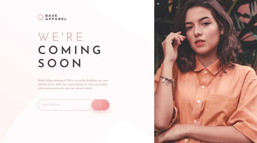
Hello to my fellow developers ! Here is my solution for base apparel comming soon ! I guess the hardest part of this challenge was staying focused while the hero lady staring into your soul πAnyway I have some questions :
- Do you have any recommendation and good sources for learning accessibility?
- I always have some trouble with setting svg backgrounds, although they look fine but I'm not satisfied with them, I set them on
body
tag, but they always look weird to me, is there anything I'm doing wrong or any other approaches that you can recommend me? - I didn't like the initial error design so I took another approach for errors in this solution, Do they function properly for you?
β I'll be happy to know your thoughts and feedbacks on this
Community feedback
- @vanzasetiaPosted over 2 years ago
Hi, Yazdun! π
Congratulations on finishing this challenge! π
Glad you manage taking care of the lady image. π
I notice that you have a
sr-only
heading one. I would suggest removing it because it's a full webpage (not a component) and also every page should only contain oneh1
.More feedback:
- Accessibility
- Good job on using
main
landmark! π - The most important content on the page is the logo, definitely not decorative, and surely not one with blank
alt=""
text. Without that information, how would a screen reader user or a search engine know what your site/project is called? - Don't use
aria-required
attribute when there's the nativerequired
attribute. In general, you should use the native HTML elements and attributes. - Well done on labeling the submit button but, there are better solutions. Use
span
withsr-only
for the text content or even better use the alternative text of the icon as the text content for the button element. Also, there's no need to tell that it is a button. It's already a button element so the screen reader will pronounce it as a button. Currently, the screen reader will pronounce it as submit button, button.
- Good job on using
<button id="btnSubmit" type="submit" class="showcase__form--submit" > <img src="./images/icon-arrow.svg" alt="Submit" /> </button>
- Input element needs a
label
element. You might want to usesr-only
label instead or make thelabel
as a placeholder instead. - Add
aria-describedby
attribute to theinput
element and reference the error element. - Styling
- Create a custom
:focus-visible
styling to any interactive elements (button
, links,input
,textarea
). This will make the users can navigate this website using keyboard (by usingTab
key) easily.
- Create a custom
- JavaScript
- I would prefer using
querySelector
and referencing or selecting the element withjs-
classes. In my opinion, it makes your code more maintainable and readable because thejs-
only be used for manipulating the DOM element with JavaScript (no CSS).
- I would prefer using
I like the custom validation that you've created, so great job! π
That's it! Hope you find this useful! π
Marked as helpful1@vanzasetiaPosted over 2 years agoHere are some resources to learn accessibility.
- Inclusive Components - Learn how to create an accessible components (toggle buttons, a todo list, etc).
- Deque - List of axe 4.4 Rules - A manual accessibility checks.
- Blog Post by Adrian Roselli - Stop Giving Control Hints to Screen Readers
- Scott O'Hara - Blog Posts
- Andy Bell - Piccalilli
- Stephanie Eckles - moderncss.dev - I like the Modern CSS Upgrades To Improve Accessibility blog post. It tells you a practical guide to improve your website accessibility.
- Checklist - The A11y Project - make sure that your webisite is accessible.
- WAVE Web Accessibility Evaluation Tool
I hope this helps you to learn more about accessibility!
Marked as helpful0@YazdunPosted over 2 years ago@vanzasetia Hello Vanza, Thanks for your awesome feedback π
I dived back to the challenge and fixed all the issues you mentioned, It was super helpful π
And the funny thing is : I've dedicated my whole time to learn accessibility and SEO for now, I tried to make this project accessible, and also navigatable (not sure if navigatable is a word π) with keyboard, so the resources you provided are like a gem to me right now and I can't thank you enough for that πβ€οΈβπ₯
0@vanzasetiaPosted over 2 years ago@Yazdun You're welcome! Glad to know it is helpful for you! π
Nice project! It looks great in my view and the
:focus-visible
styling is clear! π Is the project is going to be a real blog app? Anyway, good luck with your learning process!0@YazdunPosted over 2 years ago@vanzasetia Yes, I'm prototyping it for now, once I gain enough confidence in SEO and nextjs, I'm gonna turn it into a real blog app
1 - Accessibility
- @FlorianJourdePosted about 3 years ago
Hi @Yazdun !
Well done with that one ! I particullary like the animations in intro ! I'll dig the code later, to see how you did that.
Then, I don't know much stuff about accessibility, but I can tell you some stuffs about your
background
properties !It's a transparent .svg image, so you can add a
background: linear-gradient( 135deg, hsl(0, 0%, 100%), hsl(0, 100%, 98%))
property to yourbody
. Unfortunetely, this will remove yourbackground-image
(and alterate your animation, by the way). But that being said, I think it's better if yourbackground: url(../../images/bg-pattern-desktop.svg)
is on your.showcase
container, it seems to be the purpose, on this exercice. After all, your can still keep animation onshowcase__logo
andshowcase__wrap
, to don't show there's no background behindshowcase__img
. Doing that, you'll be closest to the design.Then, I liked your error design, with
transform: scale
on hover, pretty interactive ! One last thing : yourcolor
property for.alert .success
doesn't work for me, maybe your box shadow neither. It should be closer to the.alert
background-color
property. Ealier in the year, I read an ebook called Refactoring UI by Adam Wathan. Maybe you already know it, but it's simply a goldmine about UX & UI stuffs. The .pdf is really quick to read, and shows you all the good practise in UX/UI nowadays. I highly recommand it, the design vibes are close to the ones on this website !I hope my comment was readable, and you learned something from it ! I didn't digged into your .js file, I trust in you for this competence field..
Have a great day, keep up the nice work mate !
Marked as helpful0@YazdunPosted about 3 years ago@FlorianJourde Hello and well done back to yourself for such a great feedback π
-
So for the background issue I dived back into the challenge again, added
linear-gradient
to body which seems I completely forgot, but here is why we can't add background image to the showcase : -
Here is the issue that I run into for every challenge, it seems to me that these svgs are designed to fit
1366 x 768 pixels
, it looks great on devices with that screen size, but as soon as we go beyond that ( I mean wide screen monitors ), things start to fall apart, for example in this case,.showcase
hasmax-width
on it which will be fine when user is on laptop or any screen at1366 x 768 pixels
range, but when user is using a wider screen, there will be an ugly svg edge which I really hate it ! so I add these svgs to body tag to stretch on wider screens and they look kinda weird to me, and I run into this issue every time π There is a messy way to kinda fix this problem, I add image to markup and give position absolute to them, Now I updated this challenge background with this method and I think it got more tolerable ! I'll appreciate it if you check it out and tell me what you think about it. -
for animation, I've been avoiding it for a long time and finally decided to jump into it on this challenge, It's crazy how easy it is ! check
./stylesheets/abstracts/_animations.scss
on the repo and you will find all intro animations there, feel free to use them on your own projects ! -
for alert issue, do you mean success alert didn't show up any text ? because I'm using javascript to render error texts and maybe that's the issue, If you can be more clear on that would be great
-
For ebook's recommendation I can't thank you enough for that I've downloaded it now, such a great suggestion π
1@FlorianJourdePosted about 3 years ago@Yazdun Don't have much time to answer now, I'll do it soon ! but you're still welcome !
0@FlorianJourdePosted about 3 years ago@Yazdun Hi mate ! I finally got some time to answer to you !
First of all, it sounds weird to me that .svg images are designed for a special size. They could be done baddly sometimes, with no height/width reference for exemple, but an svg image is vectorial, by definition. It means you can resize it as much as you want, since it's only mathematical coordinates for curves and colors. It meens that you can print it over a fifty floors building if you want (not sure about the necessity however..).
So, your problem seems to mostly come from image proportions. Usually, when I put an image inside a
div
orbackground
, I try to always keep the right ratio, and svg are usually made for that. When it's about background, I often start withbackgound-size: cover
property, to keep the original ratio. Then, by training on this website, I noticed howbackground-position
property is powerful. You can even have two backgrounds and display them where you want in the same CSS property, look at this ! But it's just to give you more details ! What you did after your last commit is far more than tolerable, in my opinion !I'll, for sure, steal you this animation bunch of code for next purposes ! Thanks for inspiration, again !
When I told about alert issues, it was more like a francization, a syntax error ! Don't worry, your JS is working. I mean, the
color
and thebackground-color
don't "work" together, in my opinion. I took Refactoring UI as reference to say that, here is what I meant. But still, it's a tiny detail. By the way, hope you'll like the book ! It's a kind of my bible from now !Here it is, hope I helped you with this comment ! It's time to work on a new challenge for me now ! Talk you soon, and have fun !
Edit : Just find out this tool, while working on a new challenge. Maybe it can help you later. I guess there's no destruction, since svg are not pixel images.
Marked as helpful0@YazdunPosted about 3 years ago@FlorianJourde Silly me I was treating these svgs like images ! Now that I'm looking into it there so much that can be done with them, looks like I can even edit their ratio on my own ! Thank you so much this was greatly helpful, Keep it up and good luck on your new challenge πππ
1 -
Please log in to post a comment
Log in with GitHubJoin our Discord community
Join thousands of Frontend Mentor community members taking the challenges, sharing resources, helping each other, and chatting about all things front-end!
Join our Discord