
@Killua-22Submitted 4 months ago

Rohloffmeister
@RohloffmeisterAll comments
- @RohloffmeisterPosted about 1 month ago
Looks pretty good. The only thing missing is responsiveness. Also, in cases like this, I personally would use classList.add / classList.remove with a special class like "active" or "hidden" when making CSS changes with JavaScript, instead of changing the inline style. But this is just personal preference
0 - P@jdillard2532Submitted 3 months ago@RohloffmeisterPosted 3 months ago
Looks pretty good. Only thing I would change is something with the rating buttons on smaller screens. They can get pretty close.
1 - P@TranDanh1122Submitted 4 months agoWhat specific areas of your project would you like help with?
I try my best to keep my code look good, but i fail I dont know why, what i can do now? Please help
@RohloffmeisterPosted 4 months agoFeedback
Code Organization: The use of an object (coreProcesser) to encapsulate functionality is a good practice. However, consider breaking it down into smaller modules or functions for better readability.
Dynamic Rendering: Your methods for rendering topics, questions, and answers are effective. Ensure that you consistently handle potential errors when fetching data.
Progress Bar: I have notices that the progress bar is not correctly working when in dark mode. After turning on dark mode and submitting an answer the bar disappears.
Suggestions for Improvement
Code Formatting: Use a code formatter like Prettier to maintain consistent indentation and spacing throughout your code.
Modularization: Break down large functions into smaller, reusable ones. This will make your code easier to understand and test.
Comments and Documentation: Add comments to explain complex logic or decisions in your code, which will help others (and yourself) understand it later.
Answer to Your Question
To improve the appearance of your code, consider the following steps:
Use a Code Formatter: Tools like Prettier can automatically format your code for consistency.
Follow Best Practices: Adhere to best practices in naming conventions and structure to enhance readability.
Refactor Regularly: Regularly review and refactor your code to eliminate redundancy and improve clarity.
By implementing these strategies, you can enhance both the aesthetic and functional quality of your code.
Marked as helpful1 - P@loiccapeSubmitted 5 months agoWhat are you most proud of, and what would you do differently next time?
I successfully created a functional password generator. I prioritized having multiple functions with specific functionalities rather than large functions with a lot of code.
What challenges did you encounter, and how did you overcome them?I didnt know how to put the background color following the cursor on the range input
@RohloffmeisterPosted 5 months agoThe text looks generally good, but there are a few minor errors that can be corrected. Here's the revised version:
"Looks very good! Especially the JavaScript is very nice!
First, to your range input.
I did it with JavaScript because I couldn't find a way to do it in CSS.
slider.addEventListener("input", function () {
  const value = (slider.value - slider.min) / (slider.max - slider.min) * 100;
  slider.style.background = `linear-gradient(to right, var(--green) ${value}%, var(--very-dark) ${value}%)`;
});
First, the position of the slider is calculated and gives back a percentage value (
const value =...).This is used to give the slider a linear-gradient background, and the value is inserted. Because the end and start value of the gradient is the same value, it will be instant. This is done every time the slider is moved.
If you do this, you would also need to add the linear-gradient to your stylesheet according to the starting value of your range input. In your case, it's 50%:
input[type="range"] {
  ...
  background: linear-gradient(
    to right,
    var(--green) 50%,
    var(--very-dark) 50%
  );
  ...
}
Also, I personally would change the min and max of the range input to something like 0-20. Having a generally higher range also makes the input feel way smoother.
If you would like to change the thumb of the slider, here's how I did it:
input[type="range"] {
  width: 100%;
  height: 10px;
  appearance: none;
  background: linear-gradient(
    to right,
    var(--light-neon-green) 50%,
    var(--dark-gray) 50%
  );
  border-radius: 25px;
}

input[type="range"]::-webkit-slider-thumb {
  height: 25px;
  width: 25px;
  border-radius: 50%;
  background-color: var(--dark-gray);
  border: 2px solid var(--light-neon-green);
  appearance: none;
}

input[type="range"]::-moz-range-thumb {
  height: 25px;
  width: 25px;
  border-radius: 50%;
  background-color: var(--dark-gray);
  border: 2px solid var(--light-neon-green);
  appearance: none;
}
The last two selectors do the same, but the last one is especially for Firefox.
Important is that you do
appearance: none; this overrides the standard look of the browser.Otherwise, your code looks good. Great Job!
If you want to check out my implementation, here's the link: Frontend Mentor Project
Marked as helpful0 - @mostafa183Submitted 5 months ago@RohloffmeisterPosted 5 months ago
HTML Structure
The HTML is well-organized and uses semantic elements effectively:
- Proper use of
<!DOCTYPE html>and correct language declaration - Logical structuring with
<div>elements for containers and sections - Appropriate use of form elements like
<input>and<button> - Clear separation between input and output areas
Potential improvements:
- Utilize
<form>for input fields to enhance semantics - Implement
<fieldset>and<legend>to optimize form field grouping
CSS Styling
While the CSS creates a visually appealing layout, there are several areas that need improvement:
- Overreliance on pixel units (
px) for sizing, which can hinder accessibility and responsiveness - Lack of CSS variables for repeated values, leading to potential inconsistencies and maintenance issues
- Absence of media queries, limiting the application's responsiveness on different screen sizes
- Insufficient use of relative units (
em,rem) for better scalability - Some redundant declarations that could be optimized
Specific issues:
h1 {
    font-size: 24px;
    letter-spacing: 8px;
    color: #7f9c9c;
}
This heading style lacks flexibility. Consider using
remfor font-size andemfor letter-spacing..inputs, .outputs { padding: 20px; width: 50%; }Fixed width percentages can cause layout issues on smaller screens. A more flexible approach is needed.
input[type="number"] {
    /* ... */
    font-size: 18px;
    /* ... */
}
Again, using
pxfor font-size limits scalability.remwould be more appropriate here.Areas for significant improvement:
- Implement a CSS reset or normalize.css to ensure cross-browser consistency
- Use CSS Grid in combination with Flexbox for more complex layouts
- Implement a mobile-first approach with appropriate breakpoints
- Create a modular CSS structure using methodologies like BEM or SMACSS
JavaScript Functionality
The JavaScript code covers the basic requirements and is functional:
- Clear function structuring
- Effective event handling for user inputs
- Implementation of calculation logic
Opportunities for improvement:
- Use constants for unchanging values
- Implement input validation for more robust error handling
- Consider refactoring to improve code reusability
Overall Assessment
While this code represents a functional implementation of a tip calculator, it has room for improvement, particularly in the CSS. The HTML structure is solid, and the JavaScript fulfills the basic requirements. However, the CSS lacks modern best practices and responsiveness.
For future enhancements, consider:
- Implementing accessibility features (e.g., ARIA attributes for better screen reader support)
- Adding localization features for different currencies and languages
- Thoroughly revising the CSS for better responsiveness and maintainability
The developer shows promise in creating functional web applications but should focus on improving CSS skills and adopting modern web development practices.
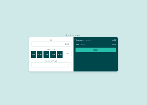
// Example of a potential refactoring for the calculation function
function calculateTip(bill, tipPercent, people) {
  if (people === 0) return { error: "Number of people can't be zero" };

  const tipAmount = (bill * (tipPercent / 100)) / people;
  const totalAmount = (bill / people) + tipAmount;

  return {
    tipAmount: tipAmount.toFixed(2),
    totalAmount: totalAmount.toFixed(2)
  };
}
This refactored function could improve code reusability and facilitate easier testing.
0 - Proper use of
- P@loiccapeSubmitted 5 months agoWhat are you most proud of, and what would you do differently next time?
I did understand pretty well how to fetch data on this JSON file, and use it top generate DOM in javascript. Maybe there is a simple way to do this project without generate everythings on js .
What challenges did you encounter, and how did you overcome them?Still not about coding , most of my challenge are how to think about the way i will do this project.
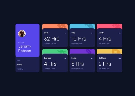
@RohloffmeisterPosted 5 months agoYour time tracking dashboard project shows good web development skills. You've successfully fetched JSON data and dynamically created DOM elements. The responsive design works well on various devices.
Strengths
- Clear JavaScript functions with good comments
- Effective use of variables for colors and images
- Well-structured and readable code
Suggestions for Improvement
- Use more HTML structure. This improves initial load time and SEO.
- Implement error handling for data fetching.
- Consider using template literals for HTML strings.
- Add smooth transitions between time frames.
- Store user preferences in local storage.
- Pay attention to accessibility with ARIA attributes.
Your approach of generating everything in JavaScript is interesting. For future projects, a mix of static HTML and dynamic JavaScript could be beneficial. This would combine the advantages of both approaches.
Your challenge in planning the project approach is normal. Try sketching the design beforehand and breaking the project into smaller tasks.
Overall, you've created a solid project. With the mentioned improvements, you can further enhance your web development skills.
Marked as helpful0 - @DerRightSubmitted 5 months agoWhat are you most proud of, and what would you do differently next time?
There is nothing I am most proud of in this question, because I was stuck in Javascript for almost a day, and I still need to strengthen my strength, so I am not particularly proud of it. ※Record: one day
在這題當中我沒有最自豪的地方,因為我卡在Javascript卡了快要一天的時間,對於自己的實力還尚需加強,所以沒有特別自豪的地方。 ※紀錄:一天
What challenges did you encounter, and how did you overcome them?Almost all of them contain a lot of Javascript, and there are also layout issues.
- The Javascript part is because I am not familiar with it, so I don’t want to click to appear or change the color, etc. It was all a big obstacle. After reading many articles and asking about ChatGPT, I slowly absorbed it myself, and finally I was able to solve it!
- The problem with typesetting is because I am a perfectionist and need to be very perfect, so I put a lot of effort into typesetting!
幾乎都是Javascript的部分比較多,還有排版的問題。
- Javascript的部分是因為本身比較不熟悉,所以對於點擊出現或是更改顏色等等。都是一大障礙,查了很多文章和詢問ChatGPT之後再自己慢慢吸收,最後才得以解決!
- 排版的問題是因為我是一個完美主義者,需要做到非常完美才可以,所以在排版上面下了很多功夫!
First of all, thank you for coming to see my finished product. I am not very familiar with Javascript yet, so I may need to improve on the grammar, as well as the css part. Please give me your advice!
首先,先謝謝您前來觀看我的成品。 我對於自己在Javascript上還沒有到很熟悉,可能在語法上還需再加強,css的部分也是,再請大家多多指教!
@RohloffmeisterPosted 5 months agoPositive Aspects:
-
The HTML structure is well-organized and semantically correct, using appropriate tags like
<article>,<section>, and others. -
The CSS utilizes modern techniques such as Flexbox for layout and custom properties for colors
-
The JavaScript code is concise and effective in implementing the share button functionality:
shareIcon.addEventListener('click', () => {
  shareOptions.classList.toggle('visible');
  shareIcon.classList.toggle('active');
});
Areas for Improvement:
-
The CSS could be moved to a separate file to enhance readability and reusability.
-
Some CSS selectors could be more specific to avoid unintended style overlaps.
Responsiveness Issues:
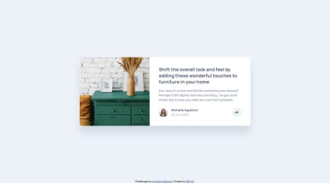
- The code uses many fixed pixel values for widths and heights, limiting flexibility on different screen sizes:
.card { width: auto; height: 300px; }- There's only one media query for the image, but none for the card layout itself:
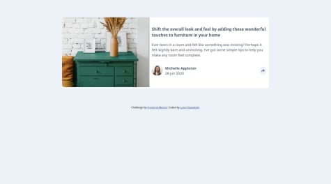
<source media="(max-width:650px)" srcset="./images/drawers.jpg" />- Potential overflow problems on smaller screens due to fixed card dimensions.
- The absolute positioning of the share option could be problematic on smaller screens:
.share-option {
  position: absolute;
  margin-top: -125px;
  margin-left: -106px;
}
To improve responsiveness, consider:
- Using relative units (%, em, rem) instead of fixed pixel values
- Adding more media queries for different breakpoints
- Implementing a more flexible layout that adapts better to various screen sizes
- Revising the share option positioning for mobile devices
- Using
max-widthandmin-widthinstead of fixed widths
It would be advisable to test the design on various devices and make appropriate adjustments to ensure better responsiveness.
Keep it up. Best Regards, Ulrich Rohloff
Marked as helpful1 - @AtaizeSubmitted 5 months agoWhat are you most proud of, and what would you do differently next time?
I'm proud to have managed to finish the project.
What challenges did you encounter, and how did you overcome them?The challenge of validating the email field using native HTML5 validation and displaying error messages using the validationMessage property.
What specific areas of your project would you like help with?I would like to know if the logic I used was good or if I could do it in a simpler way. Any suggestions for improvements will help me do better next time.
@RohloffmeisterPosted 5 months agoLooks pretty good. Only thing i would add is a way to change the email in the success window to the email input
     yourtext.innerHTML = yourtext.innerHTML.replace(
     "ash@loremcompany.com",email );
This would replace "ash@loremcompany.com" with the email that was set in the input box. "yourtext" is the variable where you have to save your paragraph in. You could add the code in your "saveEmail" Function.
kind regards, Ulrich
Marked as helpful1 - @LupoNetnSubmitted 6 months agoWhat challenges did you encounter, and how did you overcome them?
Can anyone please help me out in getting the pop up display for desktop
@RohloffmeisterPosted 6 months agoHello, good job so far. To get to your question here is my share button html
<div id="shareButton" class="share">
            <img
              id="shareImg"
              class="share-button"
              alt="Share icon"
              src="images/icon-share.svg"
            />
            <div id="shareWindow" class="share-hidden">
              <div class="content">
                <span>SHARE</span>
                <a href="" target="_blank"><img alt="Facebook Icon" src="images/icon- facebook.svg"/></a>
                <a href="" target="_blank"><img alt="Twitter Icon" src="images/icon-twitter.svg"/></a>
                <a href="" target="_blank"><img alt="Pinterst Icon" src="images/icon-pinterest.svg"/></a>
              </div>
            </div>
          </div>
This is both for my mobile and desktop view. Instead of using two share button try using one and make it hover over the popup window (z-index). Heres my css code for the popup
/* <-------------------------------------------- Dekstop -------------------------------------> */
footer .share {
    display: flex;
    position: relative;
    justify-content: center;
    align-items: center;
    width: 0px;
    aspect-ratio: 1/1;
    border-radius: 50%;
    background-color: var(--light-grayish-blue);
    z-index: 3;
  }
  .share > img.active {
    background-color: var(--light-grayish-blue);
  }

  footer .share > img {
    width: 27px;
    overflow: visible;
    aspect-ratio: 1/1;
  }

  .share-hidden {
    z-index: 15;
    position: absolute;
    bottom: 125%;
    left: 50%;
    transform: translateX(-50%);
    min-width: 200px;
    width: fit-content;
    padding: 0.5rem 1rem;
    border-radius: 10px;
    background-color: var(--very-dark-grayish-blue);
    box-shadow: 0 5px 15px rgba(0,0,0,0.1);
  }
  .share-hidden::after {
    content: '';
    position: absolute;
    top: 99%;
    left: 50%;
    border: 10px solid transparent;
    border-top-color: var(--very-dark-grayish-blue);
    transform: translateX(-50%);
  }
  .share-hidden .content {
    display: flex;
    flex-direction: row;
    align-items: center;
    justify-content: space-between;
    width: 100%;
  }

  .share-hidden img {
    height: clamp(30px, 2vw, 40px);
    aspect-ratio: 1/1;
    position: relative;
    flex-shrink: 0;
    z-index: 11;
    margin: 0 1rem;
    cursor: pointer;
    padding: auto;
  }

/* <------------------------ Mobile -------------------------------------> */

footer .share {
  display: flex;
  justify-content: center;
  align-items: center;
  min-width: 40px;
  width: 40px;
  aspect-ratio: 1/1;
  border-radius: 50%;
}

footer .share > img {
  width: clamp(12px, 4vw, 100px);
  background-color: var(--light-grayish-blue);
  aspect-ratio: 1/1;
  padding: 9px;
  border-radius: 50%;
  z-index: 11;
}

.share img.active {
  background-color: white;
}
.share-hidden {
  position: absolute;
  bottom: 0;
  left: -20px;
  right: -20px;
  background-color: var(--very-dark-grayish-blue);
  height: 100%;
  display: none;
  align-items: center;
  justify-content: flex-start;
  padding: 0 1.2rem;
  z-index: 5;
}
.share-hidden.active {
  display: flex;
}
.share-hidden .content {
  display: flex;
  align-items: center;
  justify-content: flex-start;
  width: 65%;
}

.share-hidden span {
  color: var(--grayish-blue);
  text-transform: uppercase;
  letter-spacing: 0.3em;
  margin-right: 0.5rem;
}
.share-hidden img {
  height: clamp(20px, 7vw, 40px);
  aspect-ratio: 1/1;
  margin: 0 0.5rem;
  cursor: pointer;
}
Might be a bit much but it worked for me. I bassicly have the elements from the popup inside the button div (in the html) and made the popup position absolute so i can always have it hover over the middle of the button
    z-index: 15;
    position: absolute;
    bottom: 125%; /* Offset is 125% of the button height starting from the base of the button  so the popup hovers over roughly 25 % of the button height over the button*/
    left: 50%;  /*Offset is 50% of the button width starting from the left side of the button*/
    transform: translateX(-50%) /* adds the -50% of the popup window width to the
                                                      offset*/
And for the javascript i would suggest you to use
.classList.toggle("")Sorry if its to hard to understand i dont know how to explain stuff. If you want to look at how i did this website, heres the reposetory and live website Github Repo Live Website1 - P@YelemyahMSubmitted 7 months agoWhat challenges did you encounter, and how did you overcome them?
I really struggle with image as background, taking 100% of the screen, while having a padding.
@RohloffmeisterPosted 7 months agoHi, Your Website looks good so far. To start with your problem you could try putting the footer outside of your <main> (this also helps with accessibility. If you want to know more google "HTML Semantic Elements"). I also saw that the 4 images can get pretty big. I personally would use the grid property.
/* Dekstop and Tablet*/
.img-grid{
display: grid;
grid-template-columns: repeat(4, 1fr);
}
.img-grid img{
  width: 15wv;
}

/* Tablet  */

.img-grid{
  display: grid;
  grid-template-columns: repeat(4, 1fr);
}
.img-grid img{
  width: 22wv;
}

/* Mobile */
  .img-grid {
    display: grid;
    grid-template: repeat(2, 1fr) / repeat(2, 1fr);
  }

.img-grid img{
  width:40wv;
}
Thats how i did it. I hope this helped you a bit.
Marked as helpful0 - @devmanuel1Submitted 9 months ago@RohloffmeisterPosted 7 months ago
Looks very good so far. I personaly would've added another media query(between 500px width and 1000 px width), because the boxes get really thin when you have a thin screen over 500px wide.
0 - @CitycodSubmitted 7 months agoWhat are you most proud of, and what would you do differently next time?
i would love to research more.
What challenges did you encounter, and how did you overcome them?i had issues doing the four card in different positions.
@RohloffmeisterPosted 7 months agoThat looks very good. I dont really know what could be improved. I personly would limit the width of the cards so they dont stretch so much.
Marked as helpful0 - @Muhammad-TausSubmitted 7 months ago@RohloffmeisterPosted 7 months ago
Looks very good. I dont see any problems.
Marked as helpful0 - P@arfath-aliSubmitted 7 months ago@RohloffmeisterPosted 7 months ago
Looks pretty good. Only thing i can say is that you should probably size everything up since the text is barely readable without zooming.
0 - @santhoshjavascriptSubmitted 7 months ago@RohloffmeisterPosted 7 months ago
Looks good so far. You could play around with the "font-weight:" to get the font thinner for the "Front-end developer..." part and maybe add a border radius to the buttons.
0 - @santhoshjavascriptSubmitted 7 months ago@RohloffmeisterPosted 7 months ago
Looks very good. I personaly would make the border 1px thick and I think you forgot to implement the hover state for the "HTML & CSS foundations". If you dont know what i mean look at the picture in the design folder (design/active-states.jpg). If you dont know how to do that yet maybe google for "CSS :hover".
1 - @dhiaa-zerSubmitted 7 months ago@RohloffmeisterPosted 7 months ago
Looks pretty good. Only thing i saw i that the text can get pretty small on big and wide screen (iPad Pro 1024x1366) And there are some empty lines in the myText class selector
.mytext{
    flex: 1;


    padding: 8px;
}
0