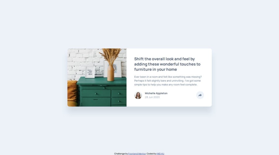
Design comparison
Solution retrospective
There is nothing I am most proud of in this question, because I was stuck in Javascript for almost a day, and I still need to strengthen my strength, so I am not particularly proud of it. ※Record: one day
在這題當中我沒有最自豪的地方,因為我卡在Javascript卡了快要一天的時間,對於自己的實力還尚需加強,所以沒有特別自豪的地方。 ※紀錄:一天
What challenges did you encounter, and how did you overcome them?Almost all of them contain a lot of Javascript, and there are also layout issues.
- The Javascript part is because I am not familiar with it, so I don’t want to click to appear or change the color, etc. It was all a big obstacle. After reading many articles and asking about ChatGPT, I slowly absorbed it myself, and finally I was able to solve it!
- The problem with typesetting is because I am a perfectionist and need to be very perfect, so I put a lot of effort into typesetting!
幾乎都是Javascript的部分比較多,還有排版的問題。
- Javascript的部分是因為本身比較不熟悉,所以對於點擊出現或是更改顏色等等。都是一大障礙,查了很多文章和詢問ChatGPT之後再自己慢慢吸收,最後才得以解決!
- 排版的問題是因為我是一個完美主義者,需要做到非常完美才可以,所以在排版上面下了很多功夫!
First of all, thank you for coming to see my finished product. I am not very familiar with Javascript yet, so I may need to improve on the grammar, as well as the css part. Please give me your advice!
首先,先謝謝您前來觀看我的成品。 我對於自己在Javascript上還沒有到很熟悉,可能在語法上還需再加強,css的部分也是,再請大家多多指教!
Community feedback
- @RohloffmeisterPosted 6 months ago
Positive Aspects:
-
The HTML structure is well-organized and semantically correct, using appropriate tags like
<article>,<section>, and others. -
The CSS utilizes modern techniques such as Flexbox for layout and custom properties for colors
-
The JavaScript code is concise and effective in implementing the share button functionality:
shareIcon.addEventListener('click', () => {
  shareOptions.classList.toggle('visible');
  shareIcon.classList.toggle('active');
});
Areas for Improvement:
-
The CSS could be moved to a separate file to enhance readability and reusability.
-
Some CSS selectors could be more specific to avoid unintended style overlaps.
Responsiveness Issues:
- The code uses many fixed pixel values for widths and heights, limiting flexibility on different screen sizes:
.card { width: auto; height: 300px; }- There's only one media query for the image, but none for the card layout itself:
<source media="(max-width:650px)" srcset="./images/drawers.jpg" />- Potential overflow problems on smaller screens due to fixed card dimensions.
- The absolute positioning of the share option could be problematic on smaller screens:
.share-option {
  position: absolute;
  margin-top: -125px;
  margin-left: -106px;
}
To improve responsiveness, consider:
- Using relative units (%, em, rem) instead of fixed pixel values
- Adding more media queries for different breakpoints
- Implementing a more flexible layout that adapts better to various screen sizes
- Revising the share option positioning for mobile devices
- Using
max-widthandmin-widthinstead of fixed widths
It would be advisable to test the design on various devices and make appropriate adjustments to ensure better responsiveness.
Keep it up. Best Regards, Ulrich Rohloff
Marked as helpful1 -
- @DerRightPosted 6 months ago
Hello @Rohloffmeister, thank you very much for your advice, is everything okay? Your advice is very helpful to me!!!!!!
Thank you so much for the positive direction you started with, I will keep it up!!!!!
Regarding areas that need improvement, I will try to present the CSS in a separate file. Then does the more specific meaning of CSS selector mean that the class naming method in HTML is more obvious and appropriate?
OK, I will study and learn what you said above about improving reaction ability! But I have a question about what does Adding more media queries for different breakpoints mean?
Your suggestions are very helpful to me!!!!!!thank you so much!!!!!!!!!!!!!! Have a nice day😊
0@RohloffmeisterPosted 6 months ago@DerRight
I'm glad that my advice has been helpful to you! Let me address your specific questions: CSS Selectors and Class Naming: Yes, more specific CSS selectors often mean that the class naming in HTML should be clearer and more descriptive. Here's an example of improved class naming:
<section class="card__author">
  <figure class="card__author-image">
    <img src="./images/avatar-michelle.jpg" alt="Michelle Appleton" />
  </figure>
  <div class="card__author-info">
    <p class="card__author-name">Michelle Appleton</p>
    <p class="card__publish-date">28 Jun 2020</p>
  </div>
</section>
These naming conventions make the structure and relationships of elements clearer. Media Queries for Different Breakpoints: This refers to adding CSS rules for different screen sizes. For example:
/* Base style */
.card { width: 100%; }

/* For tablets */
@media (min-width: 768px) {
  .card { width: 80%; max-width: 600px; }
}

/* For desktop */
@media (min-width: 1024px) {
  .card { display: flex; width: 90%; max-width: 800px; }
}
This method allows you to optimize the layout for different device types and ensure a better user experience across all screen sizes. Keep up the good work and don't hesitate to ask more questions. Have a great day as well!
0
Please log in to post a comment
Log in with GitHubJoin our Discord community
Join thousands of Frontend Mentor community members taking the challenges, sharing resources, helping each other, and chatting about all things front-end!
Join our Discord
