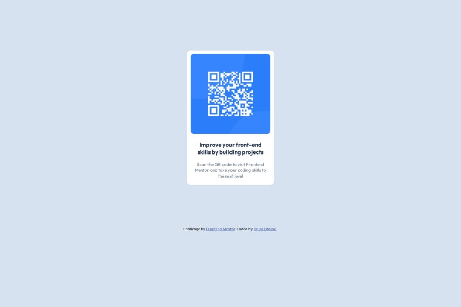
Solution Title: "Responsive QR Code Component with Custom CSS Styling"


Design comparison

Community feedback
- @jan28xPosted 8 months ago
Your solution looks really similar to the design and overall looks really well done!
The HTML is easy to read, and includes semantic HTML, like including Alt text for the image.
The layout looks generally good on both wide screens and phone screens.
It could be improved in small areas by:
- rounding the corners a little bit more using the border-radius property in css
- centering the .container div using the methods detailed here instead of relying on padding, as it seems to be closer to the bottom than the top. This is more visible on a phone screen.
Marked as helpful0 - @RohloffmeisterPosted 8 months ago
Looks pretty good. Only thing i saw i that the text can get pretty small on big and wide screen (iPad Pro 1024x1366) And there are some empty lines in the myText class selector
.mytext{ flex: 1; padding: 8px; }0@dhiaa-zerPosted 8 months ago@Rohloffmeister so what improvment should i do to avoid the first problem you mentionned
1@RohloffmeisterPosted 8 months ago@dhiaa-zer you can use the @media selector in your css like this
      @media only screen and (max-width: 1000px) {
        .yourclass{
          font-size: 20px;
        }
(this is just an exapmle) Using this the font size of "yourclass" will be 20px when the screen loading the website is under 1001px wide.You only need to include the values you want to be changed when under 1001px everything else will be taken from the other selectors. You can also use multiple like this
      @media only screen and (max-width: 1000px) {
        .yourclass {
         font-size:30px;
        }
      }

      @media only screen and (max-width: 500px) {
        .yourclass {
          font-size:20px;
        }
      }
So the font size between 1001px and 500px will be 30px and under 500px it will be 20px. Btw. when you press F12 you can click on a button in the top left(chrome) or top right(firefox) (the button should be looking like a phone or laptop) where you can test different resolutions. Hope that helped a bit.
Marked as helpful0


Please log in to post a comment
Log in with GitHub
Join our Discord community
Join thousands of Frontend Mentor community members taking the challenges, sharing resources, helping each other, and chatting about all things front-end!
Join our Discord