@snake321Submitted almost 3 years ago
Don't forget to tell me if something is wrong in my code or if i can improve my code and give your opinion/feedback.

Don't forget to tell me if something is wrong in my code or if i can improve my code and give your opinion/feedback.
Hi there, nice solution! And responsiveness is really nice!
Some advices:
max-width: 55ch;Hello everybody. Here is my solution for the challenge. I'm open for any suggest. Thanks y'all :)
Hi, nice solution!
Since you asked for suggestions, here are some ideas:
Everyhting else is very nice. :-)
And some other approaches (which are not strictly better, but maybe give new ideas, how to approach things differently):
For example:
.box::before {
display: block;
position: absolute;
content: "";
background-color: var(--primary-blue);
left: 0;
right: 0;
top: 0;
height: 0.3125rem;
}
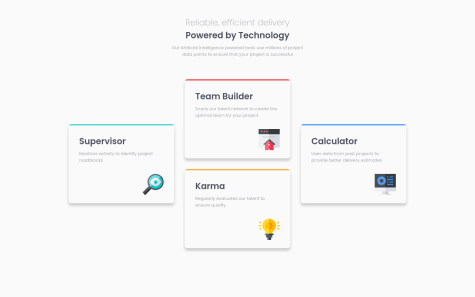
.box--supervisor::before {
background-color: var(--primary-cyan);
}
.box::after {
    float: right;
    margin-top: 2rem;
}

.box--supervisor::after {
    content: url("images/icon-supervisor.svg");
}
This is my first challenge in JavaScript and there is sill a lot of room for improvement. This is not the best solution but this is how I approach and solve the problem in my own way base of the current knowledge that I have. I am open to any suggestion or feedback. Thanks. (I changed the JS code to a much simpler one.)
I like the solution. However, I think it would be better, if the validation errors are updated when the user fixes the problems and not when he submits again.
Adding "input" event-listener could help you refresh the classes when the user changes the content.
You also could check my response to another submission, where I outlined my approach, maybe there are some ideas you like.
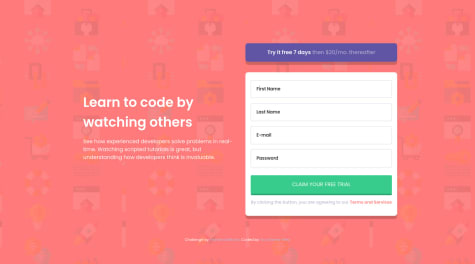
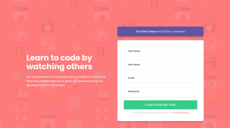
This was quite the challenge, specifically handling validation and styling at the same time. Any feedback would be appreciated.
I really like your solution, especially the animations (great idea). From a design perspective, I like it pretty much, even if it is not exactly like the template.
Regarding the validation, I would do it differently (but you have to decide yourself, if my solution can help you) Maybe some ideas work for you as well (The ideas are copied from my solution, which I didn't submit^^) I really think you could simplify your html/js with a little different approach. And then not only one error message, would be shown on submit:
Use real submit input (advantage, click listener would also be activated on submit with keyboard)
<input class = "..." type = "submit" value = "Claim your free trial">
I added a event listener, which adds a "submitted" class to the form (helps to react on form submit in css)
    document.querySelectorAll("input[type='submit']").forEach(input => {
        input.addEventListener("click", () => {
            input.form.classList.add("submitted");
        });
    });
Similar I added classes, when the inputs are changed or when validation is invalid. You can even put different invalid classes depending on the validation error by using input.validity in JS (I used the <input type="email" ...> default validation, here your solution might be better):
    document.querySelectorAll("input").forEach(input => {
        input.addEventListener("input", () => {
            refreshInputInvalidClasses(input);
        });
        input.addEventListener("invalid", () => {
            refreshInputInvalidClasses(input);
        });
    });

    function refreshInputInvalidClasses(input) {
        if (input.validity.valueMissing) {
            input.parentElement.classList.add("invalid--required");
        } else {
            input.parentElement.classList.remove("invalid--required");
        }

        if (input.validity.typeMismatch) {
            input.parentElement.classList.add("invalid--type-mismatch");
        } else {
            input.parentElement.classList.remove("invalid--type-mismatch");
        }
    }
And then I added the error messages as custom html attributes, which can also be read in css/scss. For example for the email:
                <div class = "input-container"
                     data-error-required  = "Email Address cannot be empty"
                     data-error-type-mismatch  = "Looks like this is not an email">
                    <input class = "input-field"
                           name = "email"
                           type = "email"
                           aria-label = "Email Address"
                           placeholder = "Email Address"
                           required>
                </div>
When using pseudo elements, you even don't need the validation messages as separate divs/spans, but can read them with attr in css/scss:
form.submitted .input-container.invalid--required::after {
    content: attr(data-error-required);
}

form.submitted .input-container.invalid--type-mismatch::after {
    content: attr(data-error-type-mismatch);
}
The error icon can be set as background-image, which may be simpler:
form.submitted .input-container .input-field:invalid {
    ...
    background-image: url("images/icon-error.svg");
    background-repeat: no-repeat;
    background-position-x: calc(100% - 24px);
    background-position-y: calc(50%);
}
Start learning HTML and CSS a month ago and fall in love with it. First time submitting challenge, please let me know if there is any better way to code.
Things I will change next time,
Hey there, great solution!
Here some smaller feedback:
background-color of the hover effect on the button and the link is slightly off. I think it is not supposed to be grey but a lighter (or more transparent?) variant of the "brighter blue" color.background-repeat: repeat-x; for that.main or header to improve accessibility.If anyone has any tips I would love to hear
Hi @Denismapll, nice solution!
One idea for your css.
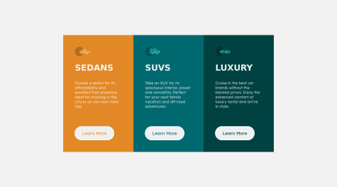
I would do one container class for the stuff the three container share and then three different classes only for the background-color for example bg-bright-orange, bg-dark-cyan and bg-very-dark-cyan.
In the html you could then do for example <div class="container bg-bright-orange">.
This has the advantage, that if you have to change the css of the container, you don't have to change it three times. Instead of making three button classes button1, button2, button3, you could use the same principle and add the different colors via descendant combinator:
.bg-bright-orange .button {
   color: var(--cc-bright-orange);
}
First project, i'd appreciate any feedback!
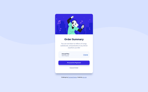
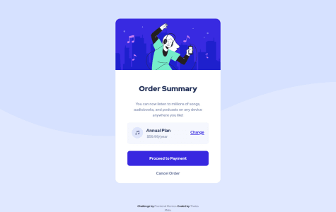
Hi @thalesmaiaa, nice solution.
Two minor problems, which could be improved:
You could use box-shadow to add the missing shadows.
Also the background-color change seems to be missing on the hover effect (on the "Change"-link and the upper button)
Some css advice, you can use variables to help reuse values like colors. Adding variables to the root element can help a lot and makes it easier to change colors later if needed.
example:
:root {
    --color-primary1: hsl(225, 100%, 94%);
}
and use them on other parts in css with var. For example:
background-color: var(--color-primary1);
1.Since i dont have a 'designer's eye', i would be really grateful if anybody points out the details i have missed out and the mistakes 2.What should be the average time taken to complete a challenge?
Hey there, I am no designer myself, but regarding your first question:
Sadly the second question I can't answer, since I am also new here, but I would be also interested in that. However, I am a (backend-)developer and I think you shouldn't stress yourself on coding-challanges in the beginning, try to concentrate on learning as much as possible. You will get faster with time and more experience.