

Design comparison
SolutionDesign

Solution retrospective
Don't forget to tell me if something is wrong in my code or if i can improve my code and give your opinion/feedback.
Community feedback
- @RibosomPosted almost 3 years ago
Hi there, nice solution! And responsiveness is really nice!
Some advices:
- I think the boxes should have a white background
- The paragraph below the main heading, is too long. It is hard to read if lines are too long. You can see in the design, that it should be shorter. You can do something like
max-width: 55ch; - I think it would help, if you format your code html/css probably, so it is easier to read for yourself and others. (Using autoformatting of an IDE like vscode can help)
Marked as helpful1@snake321Posted almost 3 years ago@Ribosom thank you so much for your reply next time I will not do this mistake
1 - Account deleted
Hi there 👋
Congratulate on finishing your project 🎉. You did a great job 💡
I give some suggestions to help you take your project design to the next level 📈😉
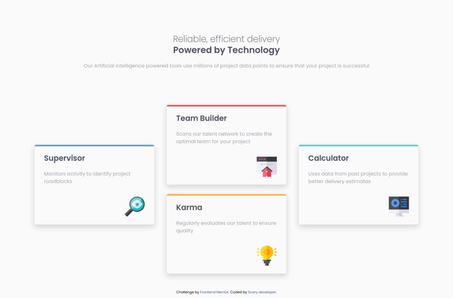
- It's not a big problem 🙂 but the Supervisor card should have a green border and Calculator blue
Happy coding ☕
Maqsud
Marked as helpful1


Please log in to post a comment
Log in with GitHubJoin our Discord community
Join thousands of Frontend Mentor community members taking the challenges, sharing resources, helping each other, and chatting about all things front-end!
Join our Discord