Not Found
Not Found
Not Found
Not Found
Not Found
Not Found
Not Found
Not Found
Not Found
Not Found
Not Found
Not Found
Not Found
Not Found
Not Found
Not Found
Not Found
Not Found
Not Found
Not Found

Submitted

Frontend mentor challenge - order summary card

Suprefuner 470

@Suprefuner

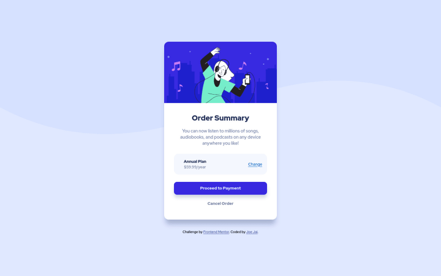
Desktop design screenshot for the Order summary component coding challenge

This is a solution for...

  • HTML
  • CSS
1newbie
View challenge

Design comparison


SolutionDesign

Solution retrospective


Start learning HTML and CSS a month ago and fall in love with it. First time submitting challenge, please let me know if there is any better way to code.

Things I will change next time,

  • separate css file and html file, bad habbit.
  • start with mobile version first

Community feedback

@pikapikamart

Posted

Hey, nice work on this one. The overall layout of the site looks nice.

Sönke Martens already gave really great feedback on this one, just going to add some suggestions as well:

  • It would be great to have a base styling of this:
html {
  box-sizing: border-box;
  font-size: 100%;
}

*,
*::before,
*::after {
  box-sizing: inherit
}

This way, handling an element specially its size will be easier because of the box-sizing

  • Avoid using height: 100vh on a large container like the body as this makes the element's height capped based on the viewport/screen's height. Instead use min-height: 100vh so that the element will expand if it needs to.
  • Also, if you zoom out of the page, you will notice that the wave-background is not occupying the full width of the site. You could add background-size: 100% on the body tag so that it will fill those gap up.
  • Always have a main element to wrap the main content of the site. For this use main tag on the .container selector.
  • Use footer on the .attribution selector so that it will be its own landmark.
  • Remember that a single h1 is needed for every page on the site. For this one, you could use h1 on the order summary for now, but if you insist on using h2 on it, then make the h1 a screen-reader only h1. Have a look at Vanza's solution on this same challenge inspect the layout and see the usage of the h1 as well the stylings applied to it.
  • For the music icon to appear, you should use src="./images/icon-music.svg" on the img tag. Currently it is using backward-slash \ and remember that root path doesn't work at github so avoid using /.
  • annual plan could use a heading tag since it gives information on what the section would contain, hence the pricing plan.
  • Lastly for the interactive components. On this one, if you think that this component is acting like a form then using button on those components will be great. But if you think that it doesn't act like form, then using a tag will be better.

Aside from those, great job again on this one.

Marked as helpful

1

Suprefuner 470

@Suprefuner

Posted

@pikapikamart Hey~ thanks for your feedback! So many new things that I haven't thought about, great appreciated! Please see if I get them right,

  • font-size: 100%, make sure every elements will using the browser default font size?
  • Would it work differently if I place box-sizing: border-box; from html to *?
  • Always using div is my bad habbit. Will use more semantic on next project.
  • Vanza's solution is good!
  • I'm always confused when to use button or a tag, thanks to clarfy!
0

@pikapikamart

Posted

@Suprefuner Hey, glad that you find my review useful:>

For some of your queries:

  • Adding the font-size: 100% on the html will make sure that your base font-size will match the user's browser settings. Because user may want to change their default font-size on their browser, so font-size: 100% will make sure that your site-content text will respond or match that user's preference.
  • It will do the same if you just put the box-sizing: border-box on the * selector, but I kind of used to setting it on the html selector as well, just making sure everything will be using it:>

Again, great job on this one and if you have any queries, just let me know^^

Marked as helpful

0

@Ribosom

Posted

Hey there, great solution!

Here some smaller feedback:

  • The icon is missing next to the "Annual plan"
  • The background-color of the hover effect on the button and the link is slightly off. I think it is not supposed to be grey but a lighter (or more transparent?) variant of the "brighter blue" color.
  • The background is not repeating on bigger screens. I would propose to make it repeating in x axis. You can use background-repeat: repeat-x; for that.
  • You could consider, using semantic html like main or header to improve accessibility.

Marked as helpful

0

Suprefuner 470

@Suprefuner

Posted

@Ribosom Hey~ thanks for your feedback!

  • It works on my computer. I checked the code again and change the link from "\images\icon-music.svg" to "images/icon-music.svg". I think it might fix the problem.
  • Well noted
  • I haven't thought about this sitiuation, changed and thanks!
  • This is my problem, always using div. I'll try using more tags on next project.
0

Please log in to post a comment

Log in with GitHub
Discord logo

Join our Discord community

Join thousands of Frontend Mentor community members taking the challenges, sharing resources, helping each other, and chatting about all things front-end!

Join our Discord