Design comparison
Solution retrospective
1.Since i dont have a 'designer's eye', i would be really grateful if anybody points out the details i have missed out and the mistakes 2.What should be the average time taken to complete a challenge?
Community feedback
- @RibosomPosted about 3 years ago
Hey there, I am no designer myself, but regarding your first question:
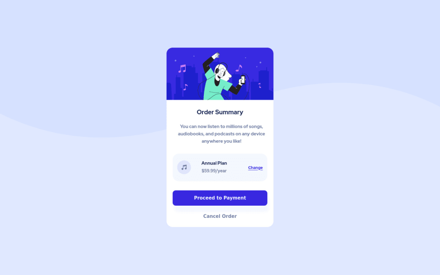
- You forget the shadows of the panel and the "Proceed to Payment" button.
- The underline under the "change" link is slightly higher. (You could use text-underline-offset for that)
- The font size of the buttons is too large.
- The color of the hover effect is off. I think (not sure myself), but for me in the design it looks more like a transparent version of the color primary 2.
Sadly the second question I can't answer, since I am also new here, but I would be also interested in that. However, I am a (backend-)developer and I think you shouldn't stress yourself on coding-challanges in the beginning, try to concentrate on learning as much as possible. You will get faster with time and more experience.
Marked as helpful0@saira512devPosted about 3 years ago@Ribosom Hey there,Thank You so much for all those points.I have worked on them all.Also when we compare our solutions to the original design here,size seem to be different n so does their positions on screen.I mean they dont seem to allign perfectly.Is that an issue or we shouldnt bother about it?
0@RibosomPosted about 3 years ago@saira512dev Since, I am no designer, I can't say, if it is really a problem. However, I think it makes sense to be as close to the design document as possible to train yourself (but needn't be pixel perfect).
I think now your underline on the change link is even worse (at least for me in firefox, it is not really visible anymore), try to put different values for text-underline-offset and see what looks most like the design document. :-D
Marked as helpful0@saira512devPosted about 3 years ago@Ribosom Actually it looks ok in chrome(which is the one i use).Since you pointed it out,i checked in firefox n yeah it looks worse.I tried to make it right but cant figure out why firefox behaves differently :(
0@RibosomPosted about 3 years ago@saira512dev Sadly I have no solution, either.
For firefox it looks fine with "text-underline-offset: 0.05rem;" for me, but in Chrome it looks better if text-underline-offset is not used. Very strange. Probably then it is best to not use text-underline-offset in this challenge. Very confusing, that the browsers behave so differently with this setting.
Marked as helpful0@saira512devPosted about 3 years ago@Ribosom Even if i dont use text-underline-offset and use just simply an anchor tag,firefox shows it that way n chrome shows it normally.Hope i figure out how i can fix this
0
Please log in to post a comment
Log in with GitHubJoin our Discord community
Join thousands of Frontend Mentor community members taking the challenges, sharing resources, helping each other, and chatting about all things front-end!
Join our Discord
