

Design comparison
SolutionDesign

Solution retrospective
Hello everybody. Here is my solution for the challenge. I'm open for any suggest. Thanks y'all :)
Community feedback
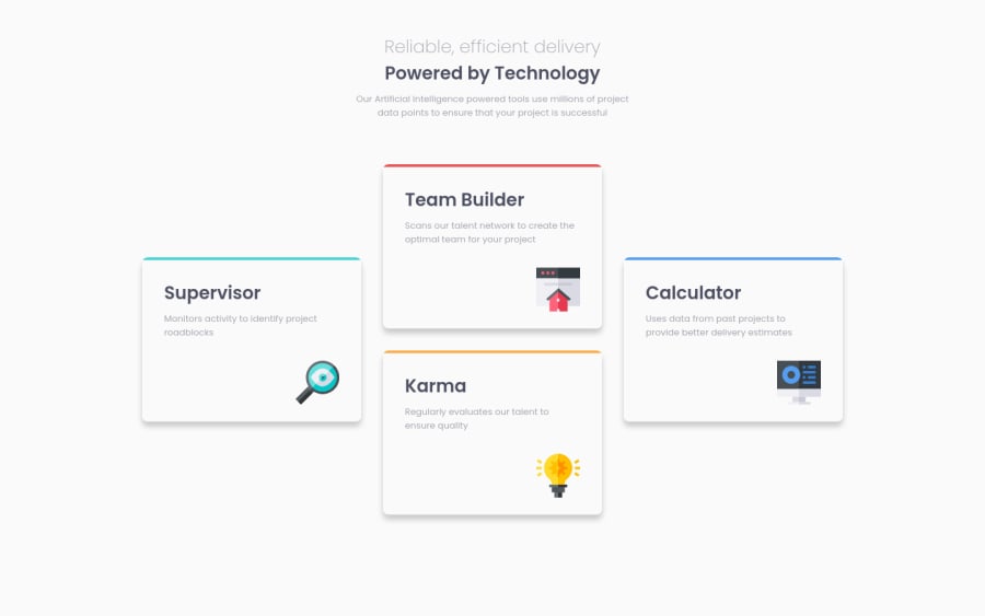
- @RibosomPosted almost 3 years ago
Hi, nice solution!
Since you asked for suggestions, here are some ideas:
- Using only h1 is not correct semantic html. A page should have only one h1.
- Working with max-width, and max-height (instead of width and height) would allow the boxes to shrink on very narrow screens
- I think the heading on big screens is smaller than in the design.
- And the background color of the boxes is white in the design, isn't it?
Everyhting else is very nice. :-)
And some other approaches (which are not strictly better, but maybe give new ideas, how to approach things differently):
- The color on top of the boxes, can also be solved with ::before pseudo element.
For example:
.box::before { display: block; position: absolute; content: ""; background-color: var(--primary-blue); left: 0; right: 0; top: 0; height: 0.3125rem; } .box--supervisor::before { background-color: var(--primary-cyan); }- The icon can also be placed with ::after pseudo element.
.box::after { float: right; margin-top: 2rem; } .box--supervisor::after { content: url("images/icon-supervisor.svg"); }- Instead of flexbox, a grid with 4 rows and 3 columns can also do the trick
0

Please log in to post a comment
Log in with GitHub
Join our Discord community
Join thousands of Frontend Mentor community members taking the challenges, sharing resources, helping each other, and chatting about all things front-end!
Join our Discord