Skip to content
Learning paths
Challenges
Solutions
Articles
Unlock Pro
Log in with GitHub
Profile
Overview
Solutions
12
Comments
0
Nanle
@N-anle
Follow
All solutions
Submitted almost 2 years ago
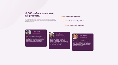
Testimonial grid section
HTML
CSS
1
2
0
Submitted about 2 years ago
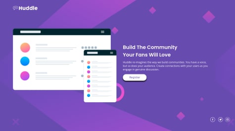
Huddle landing page using css flexbox
HTML
CSS
0
1
0
Submitted about 2 years ago
four card feature section
HTML
CSS
0
2
0
Submitted about 2 years ago
single price grid solution using html and css
HTML
CSS
0
1
0
Submitted about 2 years ago
Social proof section using html and css
HTML
CSS
0
3
0
Submitted about 2 years ago
profile card component using html and css
HTML
CSS
0
4
0
Submitted about 2 years ago
3 column preview component using css flexbox
HTML
CSS
3
2
0
Submitted about 2 years ago
Responsive-ish stats view component
HTML
CSS
1
5
1
Submitted about 2 years ago
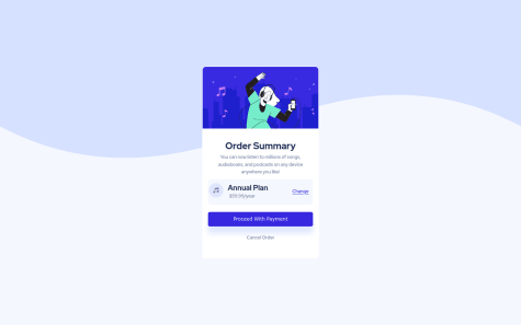
Order summary component using html and css
HTML
CSS
1
1
0
Submitted about 2 years ago
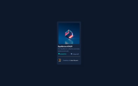
NFT preview component using HTML and CSS
HTML
CSS
1
2
0
Submitted about 2 years ago
Qr code component
HTML
CSS
1
4
0
Submitted about 2 years ago
Produt Review Card
HTML
CSS
1
4
0
