Design comparison
Solution retrospective
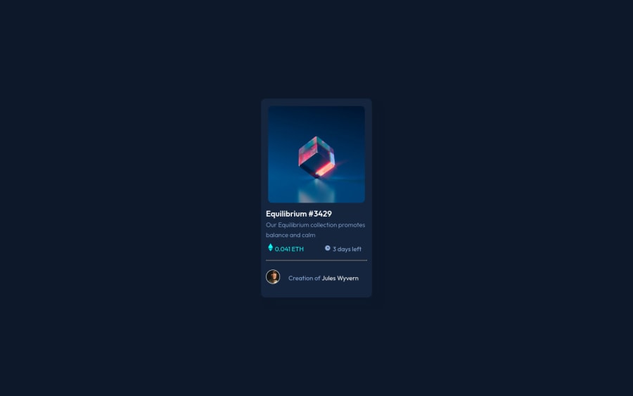
I struggled a-lot trying to align the price and time below the explainer also had a-lot of struggle trying to create the overlay effect on the image when active, I am sure I didn't take care of it in the most effective way. So any advice will be well received. Thank you all
Community feedback
- @VCaramesPosted about 2 years ago
Hey @N-anle, some suggestions to improve you code:
-
Regarding your question, you could use
display: flexplusalign-items: centeron the price/icon container. -
The NFT Alt Tag description needs to be improved upon. You want to describe what the image is; they need to be readable. Assume you’re describing the image/icon to someone.
-
Wrap the "NFT image", "Equilibrium #3429" and "Jules Wyvern" in an Anchor Tags <a>. The anchor tag will allow users to click on content and have them directed to another part of your site.
-
Your CSS Reset is extremely bare and being underutilized. To fully maximize your CSS reset, you want to add more to it.
Here are few CSS Resets that you can look at and use to create your own or just copy and paste one that is already prebuilt.
https://www.joshwcomeau.com/css/custom-css-reset/
https://meyerweb.com/eric/tools/css/reset/
http://html5doctor.com/html-5-reset-stylesheet/
Happy Coding!
Marked as helpful0 -
Please log in to post a comment
Log in with GitHubJoin our Discord community
Join thousands of Frontend Mentor community members taking the challenges, sharing resources, helping each other, and chatting about all things front-end!
Join our Discord
