Design comparison
SolutionDesign
Community feedback
- @MelvinAguilarPosted almost 2 years ago
Hi there 👋. Good job on completing the challenge ! I have some feedback for you if you want to improve your code.
HTML:
- There is no need to have many main elements. Having two or more main tags can be confusing for readers and search engines. It can also make it difficult to determine which tag is the most relevant to the content.
- Having two or more h1 tags in a webpage is not recommended because it can be confusing for search engines. Search engines use the h1 tag to determine the main topic of a page, so having multiple h1 tags can make it difficult for them to accurately assess the content of the page.
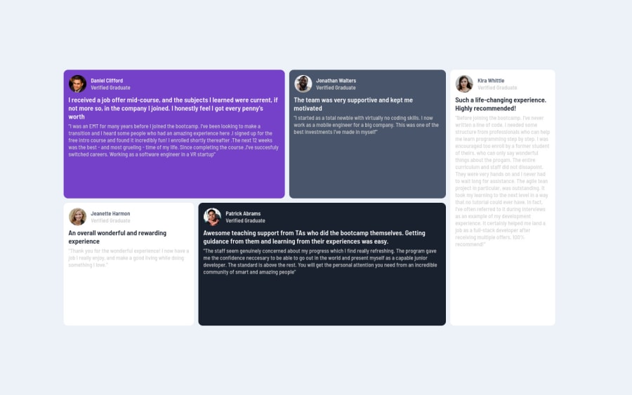
- The image with the testimonial author is not a decoration, you need to provide an alternative text to tell the user who is the author of the testimonial, its recommended to use the author's name as the
altattribute value. e.g.alt="Daniel Clifford"
If you want to learn more about the
altattribute, you can read this article.- To improve the semantics of your code you should use the
<figure>and<blockquote>tags to wrap the testimonials, with this, you will be able to encapsulate the author and the citation of the testimonial.
Example:
<figure>
	<blockquote>
		<p>"Example of a testimonial"</p>
	</blockquote>
	<figcaption>
		<p>Example of the author</p>
	</figcaption>
</figure>
You can read more about the
<figure>and<blockquote>tags with this two links:CSS:
- Use
min-height: 100vhinstead ofheight: 100vh. Theheightproperty will not work if the content of the page grows beyond the height of the viewport.
I hope you find it useful! 😄 Above all, the solution you submitted is great!
Happy coding!
0
Please log in to post a comment
Log in with GitHubJoin our Discord community
Join thousands of Frontend Mentor community members taking the challenges, sharing resources, helping each other, and chatting about all things front-end!
Join our Discord
