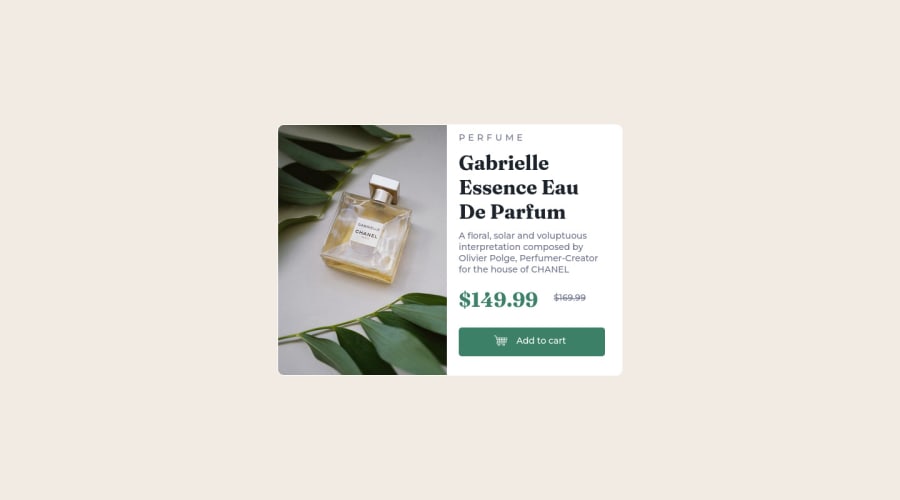
Design comparison
Solution retrospective
I tried making the site responsive but it was not working I am well aware that I most likely made lots of mistakes in the code so I will be glad if any of them will be pointed out with ways to make it better. Thank you!
Community feedback
- @correlucasPosted about 2 years ago
👾Hello @N-anle, Congratulations on completing this challenge!
Your solution its almost done and I’ve some tips to help you to improve it:
Add the website favicon inserting the svg image inside the
<head>.<link rel="icon" type="image/x-icon" href="./images/favicon-32x32.png">A better way to work this solution image, the product image is by using
<picture>to wrap it on the html instead of using it as<img>orbackground-image(with the css). Using<picture>you wrap both images (desktop and mobile) and have more control over it, since you can set in the html when the images changes setting the screen size for each image.ote that for SEO / search engine reasons isn’t a better practice import this product image with CSS since this will make it harder to the image.Here’s the documentation and the guide to use this tag:
https://www.w3schools.com/tags/tag_picture.aspSee the example below:
<picture> <source media="(max-width:650px)" srcset="./images/image-product-mobile.jpg"> <img src="./images/image-product-desktop.jpg" alt="Gabrielle Parfum" style="width:auto;"> </picture>👨💻Here's my solution for this challenge if you wants to see how I build it: https://www.frontendmentor.io/solutions/product-preview-card-vanilla-css-and-custom-hover-state-on-hero-85A1JsueD1
✌️ I hope this helps you and happy coding!
Marked as helpful0
Please log in to post a comment
Log in with GitHubJoin our Discord community
Join thousands of Frontend Mentor community members taking the challenges, sharing resources, helping each other, and chatting about all things front-end!
Join our Discord
