
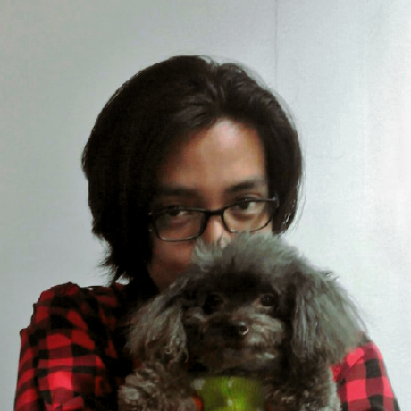
@thanhsHaiSubmitted 2 months ago

Stephen Funderburk
@Mr-FunderburkAll comments
- @Mr-FunderburkPosted 2 months ago
Nice work!
Few things:
- Make sure that you are changing all the fonts on your page to your selected body font. The inputs have a different font than the rest of your page (not a bad thing if it's intentional).
- Your inputs should have :focus states. This helps identify which input is currently being accessed without having to search for the carat (if it is a form element that has one).
- "email@example/com" should be "[email protected]"
Overall, great job! I really like the shaded background for the inputs. That was a nice touch!
0 - @Alheri-blessingSubmitted 2 months ago
- @IhdirSubmitted 2 months agoWhat are you most proud of, and what would you do differently next time?
This time, I focused on improving the container and image alignment, which had been challenging in previous projects. I also started to grasp BEM conventions and applied them where possible. Additionally, I incorporated max-width and worked on some of the feedback I received earlier to enhance my code structure and responsiveness. I'm still learning these concepts and getting my hands on them as I continue to improve.
What challenges did you encounter, and how did you overcome them?Fortunately, I didn't face any major challenges this time. The code flowed smoothly and worked as I wanted, which made the process more enjoyable.
What specific areas of your project would you like help with?I’m open to any feedback for improvement and eager to learn more. I’d appreciate help with refining my code structure and understanding areas I haven't fully worked on yet.
@Mr-FunderburkPosted 2 months agoAwesome work! Your code looks clean!
You are missing the hover state icon on your image (the eye icon).
One suggestion I have is to make sure that anything clickable (anchor tags) has its cursor changed to a pointer. This helps to indicate to the user that it is something they can click on. And it's super easy to do in CSS!
Marked as helpful2 - @CorfayaSubmitted about 1 year ago
This is my second challenge!
I'm not very happy with the process, to be honest. If anyone can feel that sense of 'too much', as I do, could you leave me some suggestions? Thank you very much!
@Mr-FunderburkPosted about 1 year agoWhat do you mean by "too much"? I think your solution is great. My only suggestion would be to use anchor tags instead of the button tag for the "Learn More" 'buttons'. Buttons are typically reserved for forms and various JavaScript functionality (in my experience). I believe web crawlers and screen readers will see anchor tags different from buttons as well, so something to consider.
Overall, nice job!
0 - @gabriel-rocha-pimentelSubmitted about 1 year ago@Mr-FunderburkPosted about 1 year ago
One thing I will point out is how you placed the card. You used a
flexboxfor the#card-of-productwith thejustify-contentset tocenter(which is great) but then you added a bunch ofpadding(360px on all sides) and awidth(1440px). This causes the screen to scroll (even on my fairly large display). You can remove the padding and the width and the flexbox will automatically horizontally center the card. You can also remove themargin: 0 autosince this is accomplished by theflexbox. For the vertical centering, if you add aheightof100vh(or 100% of the viewport height), it will center it vertically. Of course, this would cause other items to shift if you had them since this box now occupies the entire height of the viewport. Something to keep in mind!Otherwise, nice work!
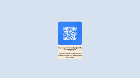
0 - @joshjavierSubmitted about 1 year ago
This is a simple exercise in practicing the rule of least power, or not using a cannon to hunt a rabbit, so to speak. It is so easy to fall into the habit of using a framework for everything even when it's overkill for the task at hand. So for this solution, I used a single
index.htmlfile - no build step, no frameworks.I did use CSS variables to make my component a little customizable. I've also thought about turning this into a web component, but ultimately felt it was unnecessary in this case.
In terms of accessibility, I decided to wrap the QR code image in a link, so if the image doesn't load (for users with slow internet) then they can still visit the link. Of course, this doesn't cover edge cases for when QR codes refer to actions other than visiting a link.
@Mr-FunderburkPosted about 1 year agoAdding the link to the QR code was a great idea!
1 - @tunabearfishSubmitted about 1 year ago
I found it difficult getting my image fit, had to do research about overflow,
I am struggling at best practice about my HTML structure and CSS, I just make containers for each section that I think is correct, but not sure if thats the best way to do things
@Mr-FunderburkPosted about 1 year agoNice job!
There are two different images we were supposed to use for mobile/desktop; though I don't think your solution is a bad one. The idea behind using two different images is to ensure the images load quickly on mobile devices. For me, I found it easiest to create a div the size of the image and set the background to be the image for desktop/mobile with media queries.
It's my understanding that we are trying to get our solution to look like the design that is given to us. Therefore, I would spend a bit more time on your CSS.
- There's an icon missing on the button -- in fact, this should have been a styled anchor tag since we're not using a form here.
- The typeface and font size of the "new" price should be changed to match the display
- The spacing you have is a lot larger than the display, however, I wouldn't say that would "lose points" on this. I do think too much space creates a disconnect; so I would bring it in a bit.
- As you've seen from the report that is generated when you submit, you're missing semantic tags (header, main, etc.). I don't fully agree with the standards because these are just snippets of what would be a larger project. However, I know that will be brought up.
- I wouldn't say it's strictly wrong to put everything in a div/container, however, it will create a lot of elements that you don't necessarily need. The image for example doesn't need a container. You could have changed its display and treated it as a block element without the use of a div. The class 'product-info' could have been left off and just targeted the h4/'title' class. Instead of a div for 'product-description', this could have been a paragraph tag, and the span isn't needed.
Overall, I would say great work!
1 - @Adex324Submitted about 1 year ago
Im finding it really hard to understand the display properties and justify content properties but i think ill get the hang of it...eventually
@Mr-FunderburkPosted about 1 year agoWhich display properties are you struggling with? You did a good job on this project. Just a couple of things: The body text ("A floral, solar...") shouldn't be bold. Having everything using a bold font creates competition instead of drawing your eyes. Compared to the original, you have a lot of extra spacing, but I don't think that really takes away from the design. It looks like you added the media query but didn't do anything to change the layout for mobile. Once you get the hang of this, I would suggest building for mobile first and then creating media queries for tablet, desktop, and larger resolutions afterward.
0 - @UgiagbewellingtonSubmitted about 1 year ago@Mr-FunderburkPosted about 1 year ago
I like 'PERFUME' in the green color, that looks nice. The body text ("A floral, solar...") should be black or gray from the example. Having everything with the green color creates competition for interest and doesn't help to make anything stand out. Moving to the mobile version, the image has a fixed width which causes a lot of white space on either side of the image. While this is fine if you're looking at the correct width, anything other than that will cause this spacing which looks off. Nice animation with the button hover effect. This effect does cause the text above it to shift so be aware of that. (I'm using Brave version 1.57.62)
Marked as helpful0 - @iamharfanSubmitted about 1 year ago@Mr-FunderburkPosted about 1 year ago
Nice work. The different color background, was that intentional to be different? The main thing I would suggest here is to increase the spacing inside the card. Particularly, the text should be pushed farther from the border of the card. Allowing more spacing between hard lines and text increases readability.
Marked as helpful1 - @LuisGonzH94Submitted about 1 year ago
I started over with the purpose of keep to practice this simple challenge. I still need to learn the measurements such as rem or em, vw and vh. Also, I need to learn when to use min or max-width and min or max-height. The qr-code challenge may not look perfect, but this new updated html and css structure look better.
@Mr-FunderburkPosted about 1 year agoGood attempt! I see just a couple of things that need to be addressed.
First, and most importantly, your QR code image is broken. This is being caused by your src attribute having a forward slash at the beginning of the URL on line 36:
<img src="/images/image-qr-code.png" alt="QR code">Removing the first forward slash like this should get the image back.<img src="images/image-qr-code.png" alt="QR code">With this layout, I don't think you need the media query. It was designed to be the size of a mobile from the beginning. By using the query in the way you have it causes unintended effects when viewed full screen.
I like your use of CSS variables to keep your code clean and easier to update!
Marked as helpful0 - @JaachimikeSubmitted about 1 year ago@Mr-FunderburkPosted about 1 year ago
Nice work! My only suggestion would be to add some spacing between the card and the attribution. I firmly believe text should be kept away from hard lines (including borders, harsh changes of background color, etc.) to keep readability at a maximum.
0