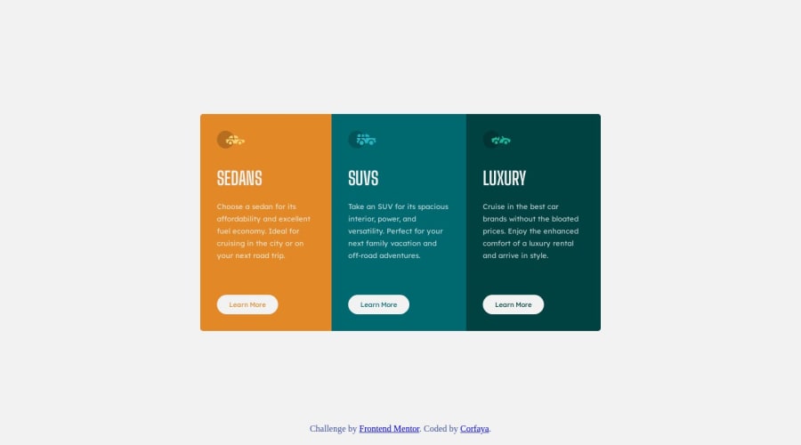
3 Column Preview Card Component Main - Challenge solution
Design comparison
Solution retrospective
This is my second challenge!
I'm not very happy with the process, to be honest. If anyone can feel that sense of 'too much', as I do, could you leave me some suggestions? Thank you very much!
Community feedback
- @Mr-FunderburkPosted about 1 year ago
What do you mean by "too much"? I think your solution is great. My only suggestion would be to use anchor tags instead of the button tag for the "Learn More" 'buttons'. Buttons are typically reserved for forms and various JavaScript functionality (in my experience). I believe web crawlers and screen readers will see anchor tags different from buttons as well, so something to consider.
Overall, nice job!
0@CorfayaPosted about 1 year ago@Mr-Funderburk Thank you very much for the suggestion! I'll take that in mind!
P.S. That 'too much' refers to my obsession with writing as little code as possible ahahahah
1@Mr-FunderburkPosted about 1 year ago@Corfaya haha! You will enjoy back-end development where you can write scripts that create the HTML for you. :P
0
Please log in to post a comment
Log in with GitHubJoin our Discord community
Join thousands of Frontend Mentor community members taking the challenges, sharing resources, helping each other, and chatting about all things front-end!
Join our Discord
