Design comparison
SolutionDesign
Community feedback
- @Mr-FunderburkPosted about 1 year ago
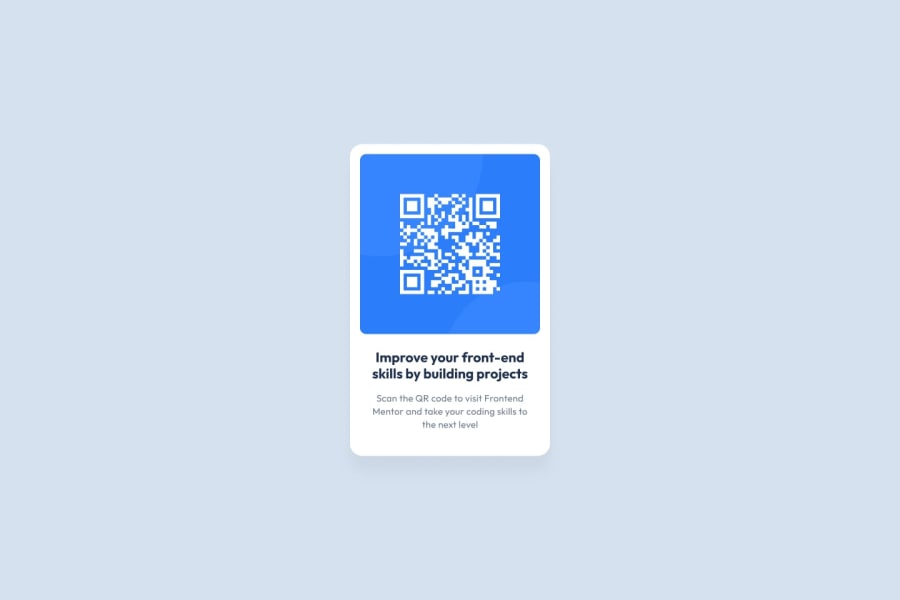
Nice work! My only suggestion would be to add some spacing between the card and the attribution. I firmly believe text should be kept away from hard lines (including borders, harsh changes of background color, etc.) to keep readability at a maximum.
0
Please log in to post a comment
Log in with GitHubJoin our Discord community
Join thousands of Frontend Mentor community members taking the challenges, sharing resources, helping each other, and chatting about all things front-end!
Join our Discord
