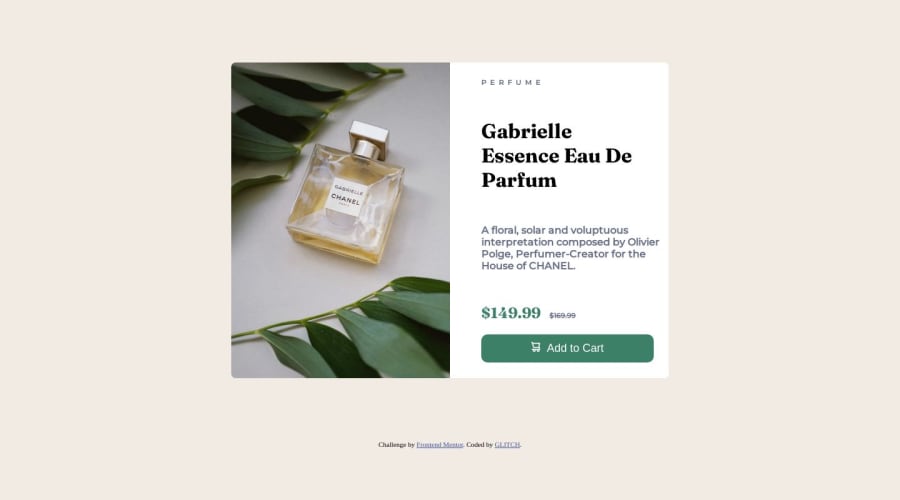
Not Found
Not Found
Not Found
Not Found
Not Found
Not Found
Not Found
Not Found
Not Found
Not Found
Not Found
Not Found
Not Found
Not Found
Not Found
Not Found
Not Found
Not Found
Not Found
Not Found

Submitted

used the grid temperate property for the first time

Adex324 130

@Adex324

Desktop design screenshot for the Product preview card component coding challenge

This is a solution for...

  • HTML
  • CSS
1newbie
View challenge

Design comparison


SolutionDesign

Solution retrospective


Im finding it really hard to understand the display properties and justify content properties but i think ill get the hang of it...eventually

Community feedback

@Mr-Funderburk

Posted

Which display properties are you struggling with? You did a good job on this project. Just a couple of things: The body text ("A floral, solar...") shouldn't be bold. Having everything using a bold font creates competition instead of drawing your eyes. Compared to the original, you have a lot of extra spacing, but I don't think that really takes away from the design. It looks like you added the media query but didn't do anything to change the layout for mobile. Once you get the hang of this, I would suggest building for mobile first and then creating media queries for tablet, desktop, and larger resolutions afterward.

0

Adex324 130

@Adex324

Posted

@Mr-Funderburk Thank you for the feedback and for the advice, and yes I didn't put the media queries because I don't know how to do that yet. So I just wanted to focus on the desktop design alone. And also the display properties I am struggling with are the in-line and flex properties, I know flex is supposed to make the div horizontal in a way and but it didn't work, I'm not sure if I'm correct but I'll watch more videos on the display properties, again thanks for the feedback. I'll keep improving.

1

@Mr-Funderburk

Posted

@Adex324 display flex is great and very powerful. I use this as a reference for my students when we talk about Flexbox. Reference

The basics for display are inline and block (also inline-block). inline elements are ones that do not create space across the width of the browser. These include span, a, em, strong, etc. block elements will take up the entire width and force the next tags below them: div, h1, etc.

Of course, with CSS we can change the display.

Marked as helpful

0
Adex324 130

@Adex324

Posted

@Mr-Funderburk thank you

1

Please log in to post a comment

Log in with GitHub
Discord logo

Join our Discord community

Join thousands of Frontend Mentor community members taking the challenges, sharing resources, helping each other, and chatting about all things front-end!

Join our Discord