Design comparison
Community feedback
- @Mr-FunderburkPosted about 1 year ago
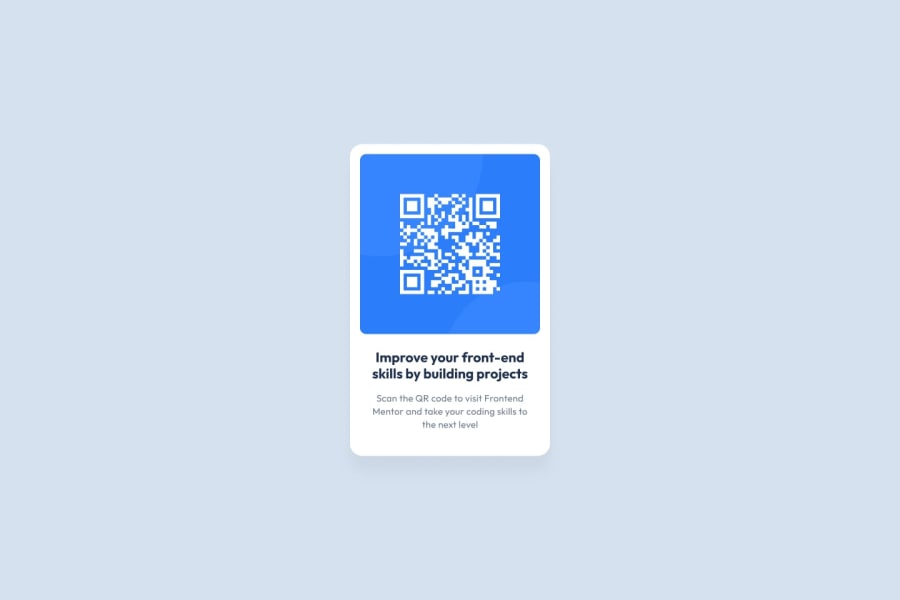
Nice work. The different color background, was that intentional to be different? The main thing I would suggest here is to increase the spacing inside the card. Particularly, the text should be pushed farther from the border of the card. Allowing more spacing between hard lines and text increases readability.
Marked as helpful1@iamharfanPosted about 1 year agoHyy @Mr-Funderburk,
I have made few changes and pushed it. But it's not showing up here, would love to hear your comment on the changes. Thanks in advance:)
1@Mr-FunderburkPosted about 1 year ago@iamharfan The text at the bottom I would make a touch larger. Since it's just basic instructions it's not too big of a deal in my opinion, however, it does get harder to read.
The biggest change I would suggest is adding more padding to the top and bottom of the main card to match the left and right sides.
Nice job!
Marked as helpful1
Please log in to post a comment
Log in with GitHubJoin our Discord community
Join thousands of Frontend Mentor community members taking the challenges, sharing resources, helping each other, and chatting about all things front-end!
Join our Discord
