@Dinesh141197

Arshad Ali Kaldane
@IamArshadAliAll comments
- @IamArshadAli
Hello There! 👋
Congratulations on completing this challenge 🎉
I like your spirit of learning from mistakes. I've nothing harsh but some insightful thoughts that might improve your code. 💡
1. Center Your Content
There are many ways to center any content; for now, we'll go with a straightforward
grid:body { display: grid; place-items: center; }2. Add some space
Let's give your content some space to breathe using
padding:.product__content { padding: 20px; // tweak the value as per your need ... }3. Order Your Image
I noticed you are using a desktop-first approach and
grid, you can order your image like this:.product-image { order: 2; // as the image is next to the content on desktop mode ... } @media (max-width: 649px) { .product-image{ order: 1; // reset the image position when on mobile } }4. Add an Overlay
The challenge has some purple tint on the image which can be achieved by using
mix-blend-mode: overlay;and::beforepseudo element..product-image { position: relative; // to make sure the overlay does not overflows } .product-image::before { content: ''; position: absolute; top: 0; left: 0; width: 100%; height: 100%; background-color: var(--clr-accent); z-index: 1; // bring the overlay on top of the image mix-blend-mode: multiply; // apply the tint effect }5. Flex your Stats
Using
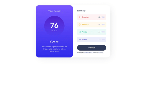
flexcan be more convenient thangridfor.stat.stat { display: flex; gap: 15px; // specify gap between each item ... } // make your flex items vertical on mobile @media (max-width: 649px) { .stat { flex-direction: column; } }Above all your solution looks great! ✨
As I said, you already did an excellent job, but these details will improve it even further. 🚀
I hope this helps 👍
Happy Coding 🤓
Marked as helpful - @Dinesh141197@IamArshadAli
Hello There! 👋
Congratulations on completing this challenge 🎉
I like your spirit of learning from mistakes. I've nothing harsh but some insightful thoughts that might improve your code. 💡
1. Center Your Content
There are many ways to center any content; for now, we'll go with a straightforward
grid:body { display: grid; place-items: center; }2. Add some space
Let's give your content some space to breathe using
padding:.product__content { padding: 20px; // tweak the value as per your need ... }3. Order Your Image
I noticed you are using a desktop-first approach and
grid, you can order your image like this:.product-image { order: 2; // as the image is next to the content on desktop mode ... } @media (max-width: 649px) { .product-image{ order: 1; // reset the image position when on mobile } }4. Add an Overlay
The challenge has some purple tint on the image which can be achieved by using
mix-blend-mode: overlay;and::beforepseudo element..product-image { position: relative; // to make sure the overlay does not overflows } .product-image::before { content: ''; position: absolute; top: 0; left: 0; width: 100%; height: 100%; background-color: var(--clr-accent); z-index: 1; // bring the overlay on top of the image mix-blend-mode: multiply; // apply the tint effect }5. Flex your Stats
Using
flexcan be more convenient thangridfor.stat.stat { display: flex; gap: 15px; // specify gap between each item ... } // make your flex items vertical on mobile @media (max-width: 649px) { .stat { flex-direction: column; } }Above all your solution looks great! ✨
As I said, you already did an excellent job, but these details will improve it even further. 🚀
I hope this helps 👍
Happy Coding 🤓
- @abbigailmerrill@IamArshadAli
Hello There! 👋
Congratulations on completing this challenge 🎉
I do have some suggestions that might interest you. 💡
Overflow:
Your content is overflowing because of two reasons:
- You've only specified
margin-leftto your.container > * - You are explicitly setting the
widthof the.listItem&.inputContainerto100%
Overflowing problems can be fixed by
.container > * {
    margin: auto 20px; // set horizontal margin to your .container children
}

.listItem {
    width: --webkit-fill-available; // acquires the available space to prevent overflowing
    ...
}
As there is a list of features, wrap them in a
<ul class="list"><li class="listItem">...</li>...</ul>instead of<span class="listItem">One more area I found that can be improved in your code is your submit button:
Button:
Instead of explicitly setting
widthandheightand then specifyingflexto center the text, you can givepaddingto the button and align the text to the center like this:<button class="button" type="submit">...</button> .button { text-align: center: padding: 10px 25px; width: 100%; // gets the full width from the parent flex container (.inputContainer) }Above all your solution looks great! ✨
As I said, you already did an excellent job, but these details will improve it even further. 🚀
I hope this helps 👍
Happy Coding 🤓
Marked as helpful - You've only specified
- @CairoGarb@IamArshadAli
Hello There! 👋
Congratulations on completing this challenge 🎉
You can center your main content using flexbox like this:
body {
    width: 100vh;
    min-height: 100vh;
    display: flex;
    justify-content: center;
    align-items: center;
}
Apart from this, you did an excellent job. ✨
Happy Coding 🤓
Marked as helpful - @HananeEL-2023@IamArshadAli
Hello there! 👋
Congratulations on completing this challenge🎉
I also faced the same issue with my projects. Here we know that our react application gets built during deployment to any server(i.e. Vercel, Netlify, Github, etc).
After a lot of trial & error, some research, and some observation, I found that when we build our react applications, the image path gets hashed e.g.
./image/bg-header.svggets converted to./image/bg-header-2f4ag3h.svg(same applies for each image type)Tailwind classes (even if you use arbitrary values
bg-[url(...)]or customize your theme) do not allow the image paths to get hashed and it remains the same even after the app is built. Hence, our production version doesn't know about the image path that Tailwind provides.The solution that I found to deal with this problem is, we need to specify our background image URL from either
inline-cssor from CSS file like this:// method 1 <div className="..." style={{ backgroundImage: `url("${image}")`, // remember to use quotes when using svg as a background image }}>...</div> // method 2 .header-bg { background-image: URL(...); // relative path to your image }Please let me know if you find anything insightful on this issue. 💡
I hope this helps. 👍
Happy Coding🤓
Marked as helpful - @PriyankaRC16@IamArshadAli
Greetings @PriyankaRC16
The challenge's screenshot provided to us are captured at a width of
1440pxfor desktop and375pxfor mobile screens. So, it's important to pay special attention to these screen sizes.You might have a display with a screen resolution of
1920x1080or something else, which is why the design looks perfect on your machine and breaks in the screenshot, as the screenshot mechanism looks for our design at1440pxwidth.You might want to consider simulating your screen using the developer tools of your browser. Most of the browsers follow the same path to access the developer tools i.e.
options > more tools > developer toolsor you can simply use the following key combinationCtrl (or Cmd) + Shift + I.Then set the dimensions of the screen to the desired size and you are good to go.
Hope this helps. Thank you🤓
- @gosiast@IamArshadAli
Hello There! 👋
Congratulations on completing this challenge. 🎉
I've some suggestions that might interest you. 💡
-
use
overflow: hidden;on your.card, it will take care of the overflowing image, and the specifiedborder-radiuswill be applied to the card. -
you can add a screenshot into the readme like this
or this<img src"./src/images/screenshot.jpg" />
Hope this helps you. 👍
Happy Coding 🤓
Marked as helpful -
- @JulienLach@IamArshadAli
Hello there! 👋
Congratulations on completing this Challenge. 🎉
I do have some suggestions that might interest you. 💡
- To fix your dropdown menu, you can follow this:
.dropdown-menu { ... min-width: 9rem; // dynamic width to your dropdown position: absolute; // to ensure absolute positioning to a relative parent margin-top: 2rem; // adds some space between the dropdown and the link padding: 2rem; ... }- Also your dropdown menu's position is set to
absolutebut it doesn't have any ancestor, due to which the menu will use the document body, and move along with page scrolling. Fix it by specifying the nearestrelativeparent like this:
.navbar .container .main-menu ul li { position: relative; }- Now you can position your features dropdown as shown in the design like this:
.features-menu { right: 0; }- One more tip: use
CSS variablesto reduce redundantly writing implicit values. For example:
:root {
  --clr-almost-white: hsl(0, 0%, 98%);
  --clr-medium-gray: hsl(0, 0%, 41%);
  --clr-almost-black: hsl(0, 0%, 8%);
}

.navbar .main-menu ul a {
  color: var(--clr-medium-gray);
  ...
}
Now you can use these variables anywhere in your CSS file and you'll only need to change the values at one place and it will affect all other places in the code.
Hope this helps to solve your problems. 🚀
Happy Coding! 🤓
- @Macury@IamArshadAli
Hello there! 👋
Congratulations on completing your first challenge on Frontend Mentor. 🎉
As for your question, I suggest the following change:
- use
mix-blend-mode: multiplyon.imgto get the desired tint
I hope this resolves your question.
Good Luck with upcoming Challenges. 👍
Happy Coding! 🤓
Marked as helpful - use
- @JAYSONRK@IamArshadAli
Hello there! 👋
Congratulations on completing this challenge. 🎉
I do have some suggestions that might interest you. 💡
- Starting with structuring your project, I recommend this article which teaches you how to create an
organized folder structurethat will make your project flexible.
project -src --assets ----images ------img.png --components ----Header.jsx --App.js --README.md- Use Barrel Exports to organise your
React Components. You can do the same with importing images and svg's .
--assets ----images ------index.js // assets/images/index.js import gamingGrowth from "./image-gaming-growth.png"; import retroPCs from "./image-retro-pcs.png"; import topLaptops from "./image-top-laptops.png"; export { gamingGrowth, retroPCs, topLaptops } // components/Extras.jsx import { gamingGrowth, retroPCs, topLaptops } from "../assets/images"-
Instead of using
<h1>for the logo, uselogo.svgthat was provided with the starter files. -
@media (min-width: 768px) {...}is usually used to style your elements for medium size devices like tablets, use@media (min-width: 640px) {...}to style for mobile
Above all your solution is great and I'm inspired by how well you've utilized
semantics HTMLto structure your code. ✌️Good luck with the upcoming challenges. 👍
Hope you found this feedback useful. 🚀
Happy Coding. 🤓
- Starting with structuring your project, I recommend this article which teaches you how to create an
- @dselimovic02@IamArshadAli
Hello there, 👋
Congratulations on completing this challenge. 🎉
I do have some suggestions to enhance your CSS by a bit. 📈
Change the
.containerto havemin-height: 100vhand keepalign-items: center;. This will ensure that your.containertakes full vertical space available on all devices and places your stats card in the center.Also, add some horizontal and vertical padding to the
.containerso that there will be some space left for your stats card to breathe on smaller devices.Bonus: Please refer to this article on
Semantic HTMLwhich teaches us how to structure our websites using semantics.Good Luck with upcoming Challenges. 👍
Happy Coding! 🤓
Marked as helpful - @Philip-Droubi@IamArshadAli
Amazing Solution with Clean Code 🚀
Out of curiosity, your clean and accurate solution led me to check the lighthouse report and congratulations it is a clear 98% 🎉
You may need to add a
<meta name="description" content="...">to your<head>and specify explicitwidthandheightto your arrow buttons to get a full score of 100%🔥Also, after reviewing your code, I learned some tricks about relatively positioning multiple images which I can use to improve my version of this challenge. ✌️
One more thing to add: You can try doing the same challenge without using JS. You just need to implement the same thing using:
<details>
  <summary>...</summary>
  <p></p>
</details>
Learn more about
<details>and<summary>elements from here.Thanks for writing such an amazing solution. 😉
Happy Coding! 🤓
Marked as helpful - @Geokobby@IamArshadAli
Hii there 👋
Great work on completing this challenge 🎉
As for your question, I suggest you check out the following resources to learn about :
Hope this Solves your Problem. 🤝
Happy Coding! 🤓
Marked as helpful - @Bombibi@IamArshadAli
Hi there, 👋
Congratulations on completing your first challenge. 🎉
As for feedback, I would suggest using semantics to improve your code structuring.
For example:
- Wrap your
.containerclass in<main>...</main>instead of<div>...</div> - Use
<footer></footer>for.attribution - Wrap 'Challenge by ...' and 'Coded by ...' in a
<p>...<a>...</a></p>
And provide a
classoridto identify and style each element. This will make your code much readable.For example:
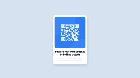
<div class="qr-card"> <img src="..." alt="..." class="qr-card__image"/> <h1 class="qr-card__title">...</h1> <p class="qr-card__desctiption">...</p> </div>Note: This technique of giving names to classes is known as BEM (Block Element Modifier)
There is a lot more ahead. Keep up the great work, and don't hesitate to reach out if you have any questions or need further assistance. 🤝
Happy coding! 🤓
- Wrap your
- @SaxenaAmogh@IamArshadAli
Hey there! Congratulations on completing your first challenge on Frontend Mentor! 🎉
It's a great achievement, and I'm glad to see your enthusiasm for learning and improving. 🎖️
After reviewing your code, here are a few areas where you can make some enhancements to further develop your skills: 🔍
- Organize Files: Consider putting your
HTML,CSS, and other relevant files into separate folders to improve the organization of your project.
| assets/ |- images/ |-- image-qr-code.png |-- screenshot.png |-css/ |-- style.css | index.html | README.md- Separate CSS: Keeping your
CSSfile separate from theHTMLwill make your code look cleaner and more maintainable.
... <head> <link rel="stylesheet" href="./assets/css/style.css"> ... </head> ...- Use Relative Values: When sizing elements in
CSS, consider using relative values likepercentages,em, orremto make your layout more flexible and adaptable to different screen sizes.
.card { padding: 1rem 0.5rem; }- Keep Color Values in
:rootStoring color values in the:rootselector allows you to define reusable variables for colors throughout your code, making it easier to maintain consistency and make global changes to your color scheme.
:root { --clr-red: hsl(0, 100%, 66%); } h2 { color: var(--clr-red); }- Play with paragraph color and shadow to make your design look more identical to the challenge
.card {
  box-shadow: .1rem 1rem 3rem lightblue;
}
These are just suggestions to help you improve your skills. 🚀
There is a lot more ahead. Keep up the great work, and don't hesitate to reach out if you have any questions or need further assistance. 🤝
Happy coding! 🤓
Marked as helpful - Organize Files: Consider putting your
- @PiotrPlotast@IamArshadAli
It's so damn true...
Stuck on a Problem? Go get some rest, Come back and code with a fresh mind.
....Always works!!!
btw, I wanna know what chrome extension do you use to see two devices parallel in a single window.
- @sumaira10041@IamArshadAli
First of all, Amazing Work!
Your desktop version does match the design.
But...
The mobile version is not responsive. As I can see you are using Flexbox which is nice. It would be best if you consider these changes inside the media query rules:
- Get rid of the "display: block" on your .container class. Instead, specify the appropriate flex-direction property.
- Increase the width of the .container class and make its height to fit the contents.
- Adjust the size of the remaining elements (if required).
Need more help? I'm here to Assist.
Happy Coding ;)
Marked as helpful