
@Rahul-JS-Dev

Ediongsenyene Joseph I.
@IEdiongAll comments
- @IEdiong
Nice one Rahul, keep it up.
- P@elisilkWhat are you most proud of, and what would you do differently next time?
I'm most proud of taking on the challenge of the "Ideas to test yourself" about noticing that the font sizes in this project are slightly smaller in the mobile layout and finding a way to reduce font size for smaller screens without using media queries. I was able to learn about how to use
What specific areas of your project would you like help with?calcandclampandvwunits to implement what I think is a nice solution for this.I feel like my text sizes, letter spacing, and line heights never quite match the solution. Not sure what the issue is there. I had access to the Figma file for this challenge, and so tried to design based around the given units in that design file rather than the jpg screenshots. So not really sure the best way to think about approaching that. Or maybe I made a mistake in reading the Figma file or in implementing the typography in some way.
@IEdiongNice work! Well executed 👍
- @Yashi-Singh-1@IEdiong
Hello Yashi 👋, great job in completing this challenge. I noticed your card's (".frame" class)
box-shadowdoesn't match that of the given Figma design along with some minor spacing values.The' box-shadow' value is
0px 25px 25px rgba(0, 0, 0, 0.05). Here is a link to a picture showing how to get CSS values and more from a Figma design (assuming you don't have the Figma dev mode).Also, Frontend mentor have a great article on how to work with a design file, I recommend you check it out to learn more about this topic.
I hope this was helpful to you, Shalom!
Marked as helpful - @tloxiu@IEdiong
Hello Roksana 👋, great job in completing this challenge. Some suggestions:
- the
divwith the.social-mediaclass can be converted into an unordered list (ul). Theultag conveys semantic meaning. - the
buttontag used for the social links can be converted to anchor tags (a) as they are meant to be "links to social sites" after all🤷♂️
Just picture your site without the styles, when someone visits it they should see a picture of the lady, her name, location and what she does, then a list of links to her social media profile. This is just to help you with the HTML semantic tag.😉
Lastly, I love the way you brought out the design with pixel precision, how did you achieve this? You mentioned that you used a "Pixel Perfect Extension", can you share the link to the extension download page?
I hope this was helpful, Shalom!
Marked as helpful - the
- @DrKelvin@IEdiong
Hello Kelvinho 👋, great job in completing this challenge. Here are some suggestions:
-
the
.nft-titleshould contain a heading tag enclosed by the<a>. eg<a class='nft-title'><h1></h1></a>. This should help fix one of the accessibility issues raised here. -
you could fix the responsiveness issue by using media queries. If you're not familiar with media queries check out this post on responsive design.
-
Also, look into the accessibility and HTML issues raised here.
I hope this was helpful to you, Shalom!
Marked as helpful -
- @emmcgill@IEdiong
Hello Erik 👋, great job in completing this challenge. Some suggestions:
-
the image of the eye doesn't show when I hover over the image. You should fix this.
-
the image should be wrapped inside an
<a>tag, since it's a clickable element. -
Look into the accessibility issues raised here. Click on the
read moreto gain more insight into the problem.
I hope this was helpful, Shalom!
Marked as helpful -
- @asifsalim@IEdiong
Hi Asif,
The stats could be an unordered list rather than a div. This is for semantics. Picture someone going through this your page without their CSS enabled, how will they consume the content. Think about this.
I hope this was helpful to you, Shalom!
Marked as helpful - @halamh@IEdiong
Hi @halamh 👋, some suggestions here:
-
Set a
max-widthinpxon the<main>tag in order to make the content look consistent even as the screen sizes increase beyond1440px. -
Look into the accessibility issue raised here. It's quite easy to fix all you have to do is just click on the learn more and read through. You would be glad that you did.
I hope this was helpful to you, Shalom!
Marked as helpful -
- @Vidottizzz@IEdiong
Hello Vidottizz 👋, nice solution. Some suggestion:
- Your blend mode doesn't seem to match that of the design, you can refer to my solution for this challenge to see how I fixed this.
I hope this was helpful, Shalom!
Marked as helpful - @KhaledAhmedKassem@IEdiong
Hello Khaled 👋, this is a well built component. Some suggestions:
-
The images are meant to have a colored border around it, refer to the design.
-
This is a personal suggestion: I feel you could play around with the layout at different screen sizes even though it wasn't given in the design. You could refer to my solution for this challenge to see how the layout changes at different screen sizes.
-
Also look into the accessibility issues raised here.
I hope this was helpful, Shalom!
Marked as helpful -
- @KhaledAhmedKassem@IEdiong
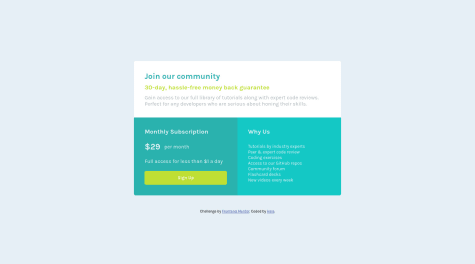
Hello Khaled 👋,
-
The content of the
.box-two pshould be an unordered list of items and not a paragraph that is formatted to look like a list of items -
The sign up button should have a
box-shadowas shown in the design -
The
border-radiusshould be set on the parent component of the whole component rather than being set on each section of the component. -
Also, look into the accessibility issues raised here.
I hope this was helpful, Shalom!
Marked as helpful -
- @vikrantmalla@IEdiong
Hello Vikrant 👋, this is a well built component. Some suggestions:
-
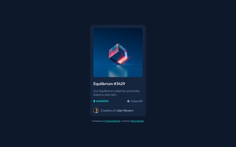
The image in the
.cardImgshould be wrapped in an<a>tag, along with the content of the<h1>and the content of the.cardCreator span. This is because those items seem to be clickable (links). -
Set the hover state of the
<h1>and.cardCreator span. The color should change on hover according to the design spec.
I hope this was helpful, Shalom!
-
- @vikrantmalla@IEdiong
Hello Vikrant 👋, this seems beautifully done. Here are some suggestions to help improve the overall experience of the site:
-
Set a
max-widthon the<main>tag, so that it doesn't exceed a certain width when the device screen size increases. This will give the site a consistent look and feel across all screen sizes above1440px. -
Look into the accessibility and HTML issues raised here.
I hope this was helpful, Shalom!
-
- @othiagomoreira@IEdiong
Hello Thiago 👋, this was 💯 well built and it's almost pixel perfect. Here are some suggestions:
- The eye doesn't show on hover of the image.
- Also look into the HTML issue raised. It seems quite easy to fix.
I hope this was helpful, Shalom!
Marked as helpful - @mrcsporto@IEdiong
Hello Marcos 👋, congrats! This is a well build solution.
Here are some suggestions:
- Look into the accessibility issues raised here.
Marked as helpful - P@LeoLoureiro-code@IEdiong
Hello Leonardo 👋, congrats on finishing this challenge.
- You seem not to be using the background image.
- I think using an
ulfor the stats is more semantic than using divs. - Also, look into the accessibility and HTML issue raised here.
I hope this was helpful, Shalom!
- @namlh023@IEdiong
Hello Ryan 👋,
- The card seems to be touching the sides of the screen at screen sizes between
376pxto447px. You could add some padding to the body to fix this.
Marked as helpful - The card seems to be touching the sides of the screen at screen sizes between
- @AyazAhmed5@IEdiong
Hello Ayaz 👋, I also made this same mistake when using font-awesome icons after not using it for a long time. Great job in completing this challenge, here are some things you could do:
-
set the
cursor: pointerrule on the clickable element such as theregisterbutton and social icons. This is good for user experience. -
make the borders of the register button more rounded.
-
Set a border on the social links and style them to look like that of the design. The facebook icon you're using isn't the right one though, you might have to change that one. You could check out my solution to this challenge to see how I achieved this.
I hope this was helpful, Shalom!
-