Design comparison
Solution retrospective
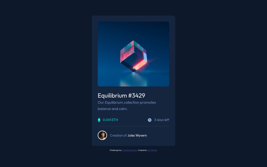
My second submission. Potential improvements include putting a transition on the hover effects and centering the icon a little better.
Community feedback
- P@IEdiongPosted over 3 years ago
Hello Erik 👋, great job in completing this challenge. Some suggestions:
-
the image of the eye doesn't show when I hover over the image. You should fix this.
-
the image should be wrapped inside an
<a>tag, since it's a clickable element. -
Look into the accessibility issues raised here. Click on the
read moreto gain more insight into the problem.
I hope this was helpful, Shalom!
Marked as helpful1@emmcgillPosted over 3 years ago@IEdiong Thank you so much for the feedback. Not sure what is going on with the first issue with the eye, but I will look into that.
0 -
Please log in to post a comment
Log in with GitHubJoin our Discord community
Join thousands of Frontend Mentor community members taking the challenges, sharing resources, helping each other, and chatting about all things front-end!
Join our Discord
