

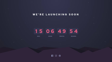


@Julr09Submitted over 3 years ago
Latest comments
- @GerLCPosted over 3 years ago
Hello! Nice work on your first challenge! It looks good.
For the responsive a method used by the majority are media queries, and some say that doing a mobile first approach might be easier when transitioning from mobile design to desktop.
For the background I don't know if the X Y axis has something to do, but for your solution I just removed the background-size: cover in the body, because this property sometimes stretch the image, you could adjust it somehow if you use it with background-position.
Another thing, is that you can see that the info or bottom part collides with the image, I would add in the card class flex-flow: column;, align-items: center and justify-content: space-between. Remove the position absolute on the image, and the top in the info class.
That's my feedback of what I would do, there could be better ways, If you got any questions or something didn't work you can ask me again.
Marked as helpful1 - @mmc1999Submitted over 3 years ago@GerLCPosted over 3 years ago
Hola, como estas!
The problem with that, I think it is because of this: On this part $form.addEventListener when you do
-
validarForm();
-
guardarLS();
In validarForm() it might take a little time to fetch the data and push it in 'enlaces' in the guardarEnlace() function, so when guardarLS() fires you see that the first click on "shorten it" in the localStorage 'enlaces' is still empty [] so in mostrarDatos() when it try to get the data it wont get it at first. But after validarForm() finish it will push the link in 'enlaces', so if you click "shorten it" with nothing in the input a second time after the first one, it will load the information.
So what it is really happening, its that every time you click the "shorten it", the information gets delayed.
For solving this problem I would put guardarLS() inside validarForm() or in guardarEnlace() i think.
Marked as helpful0 -
- @esthercateSubmitted over 3 years ago@GerLCPosted over 3 years ago
Hello! For the background image, it cant find the image source. In the background-image: url("../images/pattern-background-mobile.svg"); you forgot a dot(.) in the beginning.
Marked as helpful0 - @c-healeySubmitted over 3 years ago@GerLCPosted over 3 years ago
Hello! Nice solution. I just finished this solution recently.
For the radial background on the winner, I used on my solution:
box-shadow: 0 0 0 50px rgba(255,255,255,.05), 0 0 0 90px rgba(255,255,255,.03), 0 0 0 150px rgba(255,255,255, .01);
Where the rgba worked fine, with a white background and the last var(alpha) the opacity.
Marked as helpful0 - @0rGaan1cSubmitted over 3 years ago@GerLCPosted over 3 years ago
What I did in mine, was adding in the input a:
background: url(../images/icon-error.svg) 95% center no-repeat;
There are probably better ways to do it.
1 - @GerLCSubmitted almost 4 years ago@GerLCPosted almost 4 years ago
Could someone look into my site and tell me if it looks like the design comparison? On my laptop it looks normal even when I compare the different resolutions on the developer tools.
0


