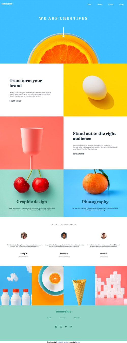
Design comparison
SolutionDesign
Solution retrospective
Was going to separate the scss in modules.
Community feedback
- @ixtkPosted over 3 years ago
- You can give flexbox children
width: 50
orflex-basis: 50%
to ensure they will only take half of the screen and won't span more than that. - At about 1000px the image/text sections on the top have big gap, they aren't connected
- At about 800px images don't take full width and have whitespace around, fix this by applying
width: 100%
to image container - At about 1000px text gets too long and I would suggest using
clamp()
to not allow more than some number of characters
These are just few issues, if you have specific questions feel free to ask
Also, check the report
1 - You can give flexbox children
- @GerLCPosted over 3 years ago
Could someone look into my site and tell me if it looks like the design comparison? On my laptop it looks normal even when I compare the different resolutions on the developer tools.
0@ixtkPosted over 3 years ago@GerLC you can generate new screenshot if you want. It looks fine on my device, though there are some problems I'll comment on
Edit: It looks messed up on mozilla firefox. Looked fine on Google but there are general issues with the layout
0
Please log in to post a comment
Log in with GitHubJoin our Discord community
Join thousands of Frontend Mentor community members taking the challenges, sharing resources, helping each other, and chatting about all things front-end!
Join our Discord