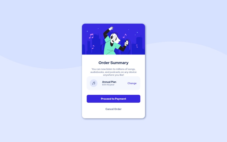
Design comparison
Solution retrospective
Hey everyone, this is my first solution and any feedback would be appreciated. if the preview looks weird to you please click preview site and if it still looks that way please let me know, because it's not what I'm seeing in my browser. Thank you.
Community feedback
- @GerLCPosted about 3 years ago
Hello! Nice work on your first challenge! It looks good.
For the responsive a method used by the majority are media queries, and some say that doing a mobile first approach might be easier when transitioning from mobile design to desktop.
For the background I don't know if the X Y axis has something to do, but for your solution I just removed the background-size: cover in the body, because this property sometimes stretch the image, you could adjust it somehow if you use it with background-position.
Another thing, is that you can see that the info or bottom part collides with the image, I would add in the card class flex-flow: column;, align-items: center and justify-content: space-between. Remove the position absolute on the image, and the top in the info class.
That's my feedback of what I would do, there could be better ways, If you got any questions or something didn't work you can ask me again.
Marked as helpful1@Julr09Posted about 3 years ago@GerLC Hey, thanks for answering, I see what you say about the background and I'm changing it right now. And about the image colliding with the text, I don't know why is being display that way a least in that comparison with the original design, because when you click in preview site it's not happening at least to me even in 4 different browsers. if there is a way i can show you what i'm seeing it in my browser i think you could help me with that. if not thank you so much for your feedback, I really appreciate it.
1@GerLCPosted about 3 years ago@Julr09 You welcome, yeah that happens to me too, that it looks good on my screen, but different in others haha, it might be because of my laptop screen size or something else.
0 - @Shazzy911Posted about 3 years ago
Excellent work I hope u will achieve your Goal
Marked as helpful1
Please log in to post a comment
Log in with GitHubJoin our Discord community
Join thousands of Frontend Mentor community members taking the challenges, sharing resources, helping each other, and chatting about all things front-end!
Join our Discord