Vishal Biradar
@vishalbrdrAll comments
- @Josue-code-lanchSubmitted about 1 year ago@vishalbrdrPosted about 1 year ago
Se verá mucho mejor si aumenta el ancho del contenedor para la pantalla del escritorio. pruebe con ancho máximo: 600 px; por lo demás luce genial. buen trabajo👍
0 - @ashishmohanty10Submitted about 1 year ago@vishalbrdrPosted about 1 year ago
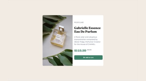
hey buddy, nice job! here are some improvements that will make your solution better:
- increase the padding for content
div - use
<button>🛒Add to cart</button>instead of<div> - use
object-fit:cover;property for image, it will fix the stretching of image.
Marked as helpful0 - increase the padding for content
- @AdrielMurraySubmitted over 2 years ago@vishalbrdrPosted over 2 years ago
set img height to 100%. set product-info height same as the product-image height. or don't specify a height for any, just set the height of the container and let flex-box take care of that.
Marked as helpful0 - @EYRAM565Submitted over 2 years ago@vishalbrdrPosted over 2 years ago
Hey, your solution works well! you can fix that dice with this code:
button {
    border: none;
    background-color: var(--NeonGreen);
    border-radius: 50%;
    margin-top: 30px;
    /* padding: 1rem; */
    position: absolute;
    top: 85%;
    height: 3rem;
    width: 3rem;
    display: flex;
    align-items: center;
    justify-content: center;
}
And wrap all your code into
<main></main>.Marked as helpful0 - P@waldekglazSubmitted almost 3 years ago@vishalbrdrPosted almost 3 years ago
I used CSS for this one. use data attribute and access it in css, design amount box using ::before element, and change the opacity of ::before element on mouse hover on the bar-graph.
1 - @Jem0Submitted almost 3 years ago@vishalbrdrPosted almost 3 years ago
Hello there, great job on the solution. You can use the box-shadow property for the hover effect.
2 - @vishalbrdrSubmitted about 3 years ago@vishalbrdrPosted about 3 years ago
Thank you very much for your advice, really appreciated
0 - @shuree0331Submitted over 3 years ago@vishalbrdrPosted over 3 years ago
It's showing your README.md on Github pages link, something's wrong.
0 - @HuKu06Submitted over 3 years ago@vishalbrdrPosted over 3 years ago
use em, rem, vw, vh rather than px.
Marked as helpful1 - @grtrspwSubmitted over 3 years ago@vishalbrdrPosted over 3 years ago
Hey! Great job, but it can be better, check out my video for solution of this challenge https://youtu.be/FIl8b9hVW54
0 - @chillcodemaoSubmitted over 3 years ago@vishalbrdrPosted over 3 years ago
you can you fontawesome for icons, btw great job.
Marked as helpful0 - @mundevuxSubmitted over 3 years ago@vishalbrdrPosted over 3 years ago
Hey great job, but it can be better, check out my video https://youtu.be/FIl8b9hVW54
0 - @Mustafa-hameed199Submitted over 3 years ago@vishalbrdrPosted over 3 years ago
It's great, it can be better, check out my video https://youtu.be/FIl8b9hVW54
0 - @dannebrobSubmitted over 3 years ago@vishalbrdrPosted over 3 years ago
Hey, Nice Job, I have uploaded a video on a solution of the 3-column preview card Newbie challenge. Check it out if you are interested https://youtu.be/FIl8b9hVW54
0 - @AurimasViSubmitted over 3 years ago@vishalbrdrPosted over 3 years ago
Hey, Great Job, It can be better I have uploaded a video on a solution of the 3-column preview card Newbie challenge. Check it out if you are interested https://youtu.be/FIl8b9hVW54
0 - @quincy-SSubmitted over 3 years ago@vishalbrdrPosted over 3 years ago
Hey, Great Job, I have uploaded a video on a solution of the 3-column preview card Newbie challenge. Check it out if you are interested https://youtu.be/FIl8b9hVW54
0 - @SolWikaSubmitted over 3 years ago@vishalbrdrPosted over 3 years ago
Hey, Great Job, I have uploaded a video on a solution of the 3-column preview card Newbie challenge. Check it out if you are interested https://youtu.be/FIl8b9hVW54
0 - @Zdravko93Submitted over 3 years ago@vishalbrdrPosted over 3 years ago
Hey, Great Job, It could be better I have uploaded a video on a solution to the 3-column preview card Newbie challenge. Check it out if you are interested https://youtu.be/FIl8b9hVW54
0


