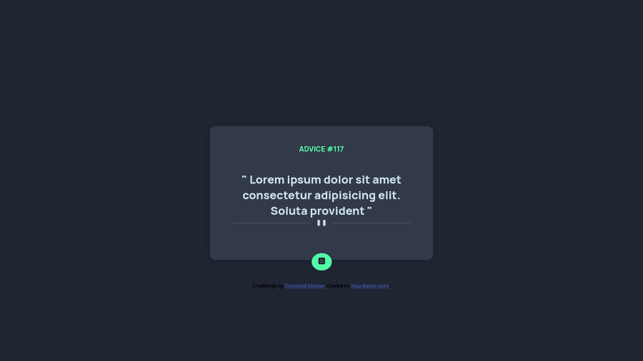
Design comparison
Solution retrospective
feedback on how to improve the ui and responsiveness are welcome
Community feedback
- @MaikolrmPosted over 2 years ago
To be honest there is not much to do on resposive design, but here some tips. You can set a default dinamic value to the container and then, limit the container width with the max-width property.
.container { width: 100%; max-width: 400px }
Marked as helpful0 - @vishalbrdrPosted over 2 years ago
Hey, your solution works well! you can fix that dice with this code:
button {
    border: none;
    background-color: var(--NeonGreen);
    border-radius: 50%;
    margin-top: 30px;
    /* padding: 1rem; */
    position: absolute;
    top: 85%;
    height: 3rem;
    width: 3rem;
    display: flex;
    align-items: center;
    justify-content: center;
}
And wrap all your code into
<main></main>.Marked as helpful0
Please log in to post a comment
Log in with GitHubJoin our Discord community
Join thousands of Frontend Mentor community members taking the challenges, sharing resources, helping each other, and chatting about all things front-end!
Join our Discord
