Design comparison
Solution retrospective
Any feedback is welcome.Code wise(same result, less code?), any mistakes, or even "better solutions"? Thank you in advance :)
Community feedback
- @VCaramesPosted about 2 years ago
Hey @Zdravko93, some suggestions to improve you code:
-
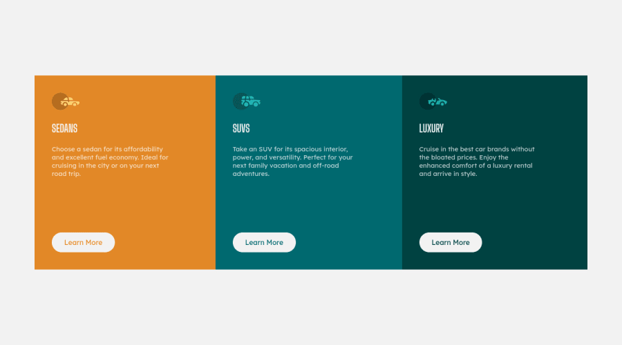
The car images/icons serve no other purpose than to be decorative; They add no value. Their Alt Tag should left blank and have an aria-hidden=“true” to hides it from assistive technology.
-
Add a
padding
to the Body Element to prevent your component from touching the sides of your screen.
Happy Coding! 👻🎃
0 -
- @vishalbrdrPosted over 3 years ago
Hey, Great Job, It could be better I have uploaded a video on a solution to the 3-column preview card Newbie challenge. Check it out if you are interested https://youtu.be/FIl8b9hVW54
0@Zdravko93Posted over 3 years ago@vishalbrdr Thanks for the feedback, man!I will look it up.
0
Please log in to post a comment
Log in with GitHubJoin our Discord community
Join thousands of Frontend Mentor community members taking the challenges, sharing resources, helping each other, and chatting about all things front-end!
Join our Discord