Latest solutions
Latest comments
- @nati-piSubmitted about 3 years ago@v-codeyPosted about 3 years ago
hey @nati-pi ,
the problem with your solution is not hidden, you can also see there are issues. However I suggest some things that will probably fix it.
- provide
height: 28rem;&width: 13rem;in the.paddso that the button doesn't flow out - instead of setting button margin top set the
pwith a min-height of11 to 14rem. ( the issue with btn margin-top here is that the button position is dependent on the text length if the text is more then the button will not be aligned with each other). - in media queries set body height to 100%
- remove container height & width and set border-radius with overflow hidden on container. In that way you wont have to set individually for every card
keep learning happy coding
Marked as helpful0 - provide
- @BlackSheldtSubmitted about 3 years ago@v-codeyPosted about 3 years ago
hey @BlackSheldt congratulations on completing your first challenge.
there are some issues with your design.
- using pc.css i.e. media query for bigger screen was not that necessary for this challenge.
- however
%as units works not that great at times, I suggest using px or rem.
overall you did good.
keep learning happy coding 👍
0 - @vijay0609Submitted about 3 years ago@v-codeyPosted about 3 years ago
Hey @vijay0609,
Great Job on the challenge. Very close to the provided design. kudos
however there are somethings which i would like to mention
- although this challenge requires minimum html, but instead of internal css its better practice to have separate css file and link that.
- also try to use
reminstead ofpxespecially in width, heights and font-size. - position and transform worked really well in this challenge, you can also try flex-box in body it will give same results
body {
    display: flex;
    align-items: center;
    justify-content: center;
    min-height: 100vh;
}
hope its helpful for you. keep learning happy coding
Marked as helpful0 - @PatelNikhil-08Submitted about 3 years ago@v-codeyPosted about 3 years ago
Hello @PatelNikhil-08 ! Congratulations on completing this challenge
There are a few suggestions I would like to give you
- Add
maintag inside body - Use padding where needed, instead of every sides(i.e. top, bottom, left, right) you can also use combo like top-bottom or left-right to make it more closer to provided design.
- Its better not to remove the default code provided by frontend mentor like you have removed the link the
atag . Do not remove it, rather replace thedivwithfooter - the body of the html should be like
<body> <main class="container"> <-- Your code --> </main> <footer class="attribution"> Challenge by <a href="https://www.frontendmentor.io?ref=challenge" target="_blank">Frontend Mentor</a>. Coded by <a href="Your profile link"> your name </a>. </footer> </body>- For better understanding follow this link
I hope it was helpful, keep learning happy coding.
0 - Add
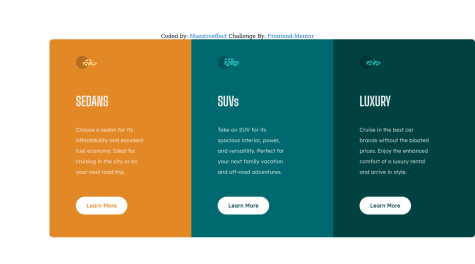
- @maestroeffectSubmitted about 3 years ago@v-codeyPosted about 3 years ago
hey @maestroeffect
I reviewed your code you've done a good job just needed some tweak and use different technique. check your github repo.
- you need to learn about DRY principle.
- use root pseudo selector
- using
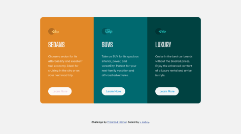
positionwith hard coded value of positionleft: 20rem,top: 15remto make card side by side is not very smart choice according to me.
those were some of my observations, keep learning happy coding.
Marked as helpful0 - @Briancarlo24Submitted about 3 years ago@v-codeyPosted about 3 years ago
Hi @Briancarlo24, Really good job on the challenge, Just few things you may haven't done right
- size of the card, font etc. is much bigger then the provided design
bodybackground color isn't set- main container needs to white too, else its taking body background color.
that was my few observations.
Happy CodingMarked as helpful0
