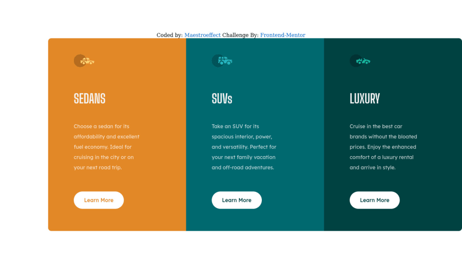
3-column preview card component solution using Html and CSS
Design comparison
Community feedback
- @v-codeyPosted about 3 years ago
hey @maestroeffect
I reviewed your code you've done a good job just needed some tweak and use different technique. check your github repo.
- you need to learn about DRY principle.
- use root pseudo selector
- using
positionwith hard coded value of positionleft: 20rem,top: 15remto make card side by side is not very smart choice according to me.
those were some of my observations, keep learning happy coding.
Marked as helpful0@maestroeffectPosted about 3 years ago@v-codey thank you very much, I appreciate it
0 - @denieldenPosted about 3 years ago
Hi Precious,good job! I took some time to look at your code and have some ideas for improving it:
- with
font-family:" Big Shoulders Display ", cursivethe browser will use the Comics Sans font when it doesn't find the first font indicated (you can seen during loading)... for the designer it's a really awful font! I would rather replace it with afont-family:" Big Shoulders Display ", sans-serifmuch more similar to the primary font. - add
maintag and wrap the card for improve the Accessibility - remove all
marginfrom body - try to use flexbox to the body for center the card. Read here -> best flex guide
- after, add
min-height: 100vhto body because Flexbox aligns child items to the size of the parent container and removeheight: 37.5rem
Overall you did well 😉
Hope this help and happy coding!
Marked as helpful0 - with
Please log in to post a comment
Log in with GitHubJoin our Discord community
Join thousands of Frontend Mentor community members taking the challenges, sharing resources, helping each other, and chatting about all things front-end!
Join our Discord
