


@momenkamal221
Latest solutions
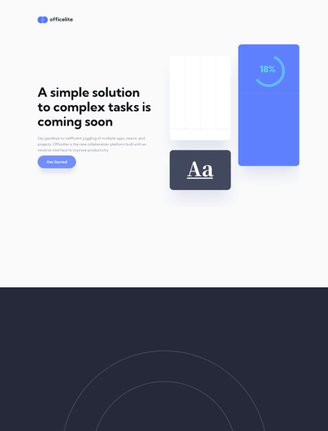
Officelite Coming Soon - Svelte + Routing | TS | SCSS | GSAP
#gsap#sass/scss#svelte#typescript#accessibilityPSubmitted about 3 years agoFullstack QR Code Generator - Svelte-TS | Express | MongoDB | and more
#accessibility#express#svelte#typescript#mongodbPSubmitted over 3 years agoMeet Landing Page | Svelte + SCSS + GSAP - Animation Powerhouse
#bem#sass/scss#svelte#gsapPSubmitted over 3 years ago3 Column Preview Card Component || Svelte - SCSS - CSS Animations
#sass/scss#svelte#bemPSubmitted over 3 years agoPod Request Access LP || Svelte - SCSS - Vanilla JS - CSS Animations
#sass/scss#svelte#bemPSubmitted over 3 years ago
Latest comments
- P@remusbuhaianu
Hey @momenkamal221, congrats on completing the challenge!
I had a look at your final solution and I have a few suggestions for you that I hope will be useful:
-
You don't need to set a
heightproperty on your .card - your layout should be created in such a way to naturally adjust to the available content. When you set fixed values for your height, or even width, it becomes more difficult to create a robust responsive design. -
You can vertically and horizontally center your design by using flex display on your body element. Also, add
min-height: 100vhto your body element https://alligator.io/css/viewport-units/ -
Your .card is also missing a box-shadow -> refer to the original design
-
Change styling for the
.unitelements. Currently, they're a bit different from the original design -
You don't need an hr element. You can simply set a
border-topproperty on your.flip-scoreselement and then also addpadding-topas to push the line further above
Hope this helps. Keep up the good work!
Marked as helpful -
- @wisdompythonP@remusbuhaianu
Hey @wisdompython , good job on completing this challenge!
I had a look at your final solution and I have a few suggestions that I hope will be useful to you:
-
Don't use a fixed height on your card element, especially not with an absolute unit such as px. Your layout should be built around the available content.
-
Set
min-height: 100vhon your body element if you want to center vertically and horizontally everything inside it. -
Wrap your card inside a <main></main> element to remove some of the errors from your report
-
Add the
altattribute to your img element - if the img is just for decorative purposes, then you can simply writealt="" -
The 2 text hover effects and the image overlay hover effect are missing from your solution. Consider implementing them using the :hover pseudo-class https://www.w3schools.com/cssref/sel_hover.asp
-
You don't need an hr to create that line. You can set a
border-topproperty on your footer and then also add apadding-topto push the line away from the content
Hope my suggestions will be useful to you. Keep up the good work!
Marked as helpful -
- @TejaswiniLabadeP@remusbuhaianu
Hey @TejaswiniLabade, good job on completing this challenge!
I'm impressed with how similar to the original design your final solution looks - well done!
As @denielden already suggested, you can consider adding the transition property for your hover effects, mainly the image hover effect as it can give it that extra nice detail ;)
Had a look at your Github repo and you should definitely consider looking into BEM methodology. Also, some parts of your code require a bit of formatting so they can be more readable.
Overall, well done. Keep up the good work!
Marked as helpful - @jdevelopsP@remusbuhaianu
Hey @jdevelops, congrats on completing this challenge!
I had a look at your final solution and I have a few suggestions that I hope will be useful to you:
-
You can vertically and horizontally center your .main-box by using flex display on your body element
-
There's an issue with the responsive design when scaling down to smaller screen sizes. I suggest not using fixed px values for your width as it can make it more difficult when building a responsive design. Have a look through your media queries code and see what improvements you can make
-
Adding a little transition on the image hover effect would be a nice bonus ;)
Overall, you did quite a nice job. Keep up the good work!
Marked as helpful -
- @abhishekdwaghmare2000P@remusbuhaianu
Hey @abhishekdwaghmare2000, good job on completing the Stats Preview Card challenge!
I had a look at your final solutions and here are a few suggestions I have for you:
-
Consider implementing the responsive media query breakpoint sooner (i.e at a larger size)
-
The top right and bottom right edges of the image should be rounded (same value for the card's left side)
-
Increase
line-heightandfont-sizeof the p element inside .content-left -
Use the values 100, 400, and 700 for your
font-weightproperty -
Use actual values (or variables) for your
font-size property. Don't usesmall,medium` or other such keywords -
Setting a
background-colorproperty on your img element and using it withmix-blend-modewon't work becausemix-blend-modeis actually blending the img element with the card's background color. A possible solution is to remove the img element and just add a background image on the.content-rightdiv and then you can usebackground-blend-modeto create the desired effect
Hope these suggestions will prove useful. Keep up the good work!
-
- @skyv26P@remusbuhaianu
Hey @skyv26 , always nice seeing more of your projects here on Frontend Mentor!
I appreciate how you always try to make your solution as pixel-perfect as possible! ;)
Here are my suggestions / observations based on your design:
-
There shouldn't be a 0 value on the slider as far as I know. The first value on the slider should be 10k page views at 8$ (I might be wrong about this, please do double check to make sure)
-
On laptop resolution, the background image doesn't fully stretch horizontally from one end to another of the body's width
-
Try to reduce the card's box shadow a bit - reduce the shadow opacity and maybe also tweak the blur amount too
-
The folder structure was a bit confusing because you have a sass folder and a css folder but the main sass file is actually inside the CSS folder
I have to ask you something: Did you actually write over 1000 lines of raw SCSS code?? That's incredible!
As developers, we all should strive to write clean, efficient, maintainable, and reusable code with the least amount of lines of code that's realistically possible. An educated guess from me would be that the design for this project can be completed in less than 500 lines of SCSS code.
I like the way you write and structure your code. You're quite a competent developer, no doubt. But you shouldn't do two things at once while working on such projects: coding and writing novels because that's how long your lines of code can get to the point that it feels like reading a page from a novel :))
I'm looking forward to seeing more of your solutions here on Frontend Mentor. Keep up the amazing work!
Marked as helpful -