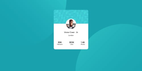
Design comparison
Solution retrospective
Hey, I was a little bit confused about what challenge should I pick. I chose that one and it looks very similar to the last challenge I picked - NFT preview card component -, just the background was challenging for me, so my question is, what approach should I follow that will help me at picking the next challenges? or should I just do all of it?
Community feedback
- @MohtashimAli85Posted almost 3 years ago
I think you are not resetting the CSS. Add reset css. This should be enough
*{ margin:0; padding:0; box-sizing:border-box; }
Also try to center the card component. using hard values of margin is not a good approach. You can use display flex or position absolute and when there is a single component on your page give body hieght of 100vh when using display flex so that it can take all the space then centering component will be easy.
body{ position: absolute; top:50%; left:50%; transform:translate(-50%,-50%); }
And remove margin-top for card class.
Hope it helps ^^.
Marked as helpful0 - @MiculinoPosted almost 3 years ago
Hey @momenkamal221, congrats on completing the challenge!
I had a look at your final solution and I have a few suggestions for you that I hope will be useful:
-
You don't need to set a
height
property on your .card - your layout should be created in such a way to naturally adjust to the available content. When you set fixed values for your height, or even width, it becomes more difficult to create a robust responsive design. -
You can vertically and horizontally center your design by using flex display on your body element. Also, add
min-height: 100vh
to your body element https://alligator.io/css/viewport-units/ -
Your .card is also missing a box-shadow -> refer to the original design
-
Change styling for the
.unit
elements. Currently, they're a bit different from the original design -
You don't need an hr element. You can simply set a
border-top
property on your.flip-scores
element and then also addpadding-top
as to push the line further above
Hope this helps. Keep up the good work!
Marked as helpful0 -
- @rsrclabPosted almost 3 years ago
Hi, @momenkamal221 ~
Congratulate on your solution to the challenge on FM platform. I have studied your work carefully and learned a lot from it.
Here are some of the tips I like to provide.
- On smaller devices, card goes over screen, and I think
max-width: 100%
can solve this issue. - Please try BEM for naming element classes. It will help you a lot on bigger projects.
- About next challenge, I suggest you to try Space Travel one.
https://www.frontendmentor.io/solutions/profile-card-solution-m-cH4D2Lp
Here is my solution to this challenge, and if it can help you even a bit, it would be happy to me.
Cheers ~
Marked as helpful0 - On smaller devices, card goes over screen, and I think
Please log in to post a comment
Log in with GitHubJoin our Discord community
Join thousands of Frontend Mentor community members taking the challenges, sharing resources, helping each other, and chatting about all things front-end!
Join our Discord