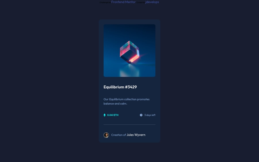
Design comparison
Solution retrospective
Still have some issues with this design. Most irritating is <a> attribute sticking out of a parent div any ideas how can i fix it quickly ?
Community feedback
- @MiculinoPosted almost 3 years ago
Hey @jdevelops, congrats on completing this challenge!
I had a look at your final solution and I have a few suggestions that I hope will be useful to you:
-
You can vertically and horizontally center your .main-box by using flex display on your body element
-
There's an issue with the responsive design when scaling down to smaller screen sizes. I suggest not using fixed px values for your width as it can make it more difficult when building a responsive design. Have a look through your media queries code and see what improvements you can make
-
Adding a little transition on the image hover effect would be a nice bonus ;)
Overall, you did quite a nice job. Keep up the good work!
Marked as helpful2 -
- @rsrclabPosted almost 3 years ago
Hi, @jdevelops ~
Congratulate on your solution to the challenge on FM platform. I have studied your work carefully and learned a lot from it.
Here are some of the tips I like to provide.
- I suggest you to try transition on hoverable elements like image, heading and creator name.
- Please try BEM for naming element classes. It will help you a lot on bigger projects.
https://www.frontendmentor.io/solutions/my-first-solution-on-chanllenge-V-4IzAivH
Here is my solution to this challenge, and if it can help you even a bit, it would be happy to me.
Cheers ~
Marked as helpful2@jdevelopsPosted almost 3 years ago@tymren608 Thank you soo much for BEM tip, it is really helpful even in small projects !
0
Please log in to post a comment
Log in with GitHubJoin our Discord community
Join thousands of Frontend Mentor community members taking the challenges, sharing resources, helping each other, and chatting about all things front-end!
Join our Discord
