Skip to content
Learning paths
Challenges
Solutions
Articles
Unlock Pro
Log in with GitHub
Profile
Overview
Solutions
11
Comments
0
NT-squared
@nt-squared
Follow
All solutions
Submitted about 2 years ago
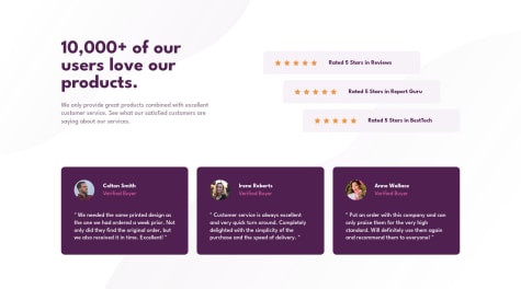
Social proof section
HTML
CSS
2
3
0
Submitted about 2 years ago
Huddle landing page with single introductory section using CSS Grid
HTML
CSS
1
5
0
Submitted about 2 years ago
Single price grid component using CSS Grid
HTML
CSS
0
2
0
Submitted about 2 years ago
Four card feature section using CSS Grid
HTML
CSS
0
3
0
Submitted about 2 years ago
Profile card component
HTML
CSS
1
3
0
Submitted about 2 years ago
Stats preview card component
HTML
CSS
1
6
0
Submitted about 2 years ago
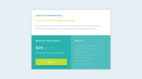
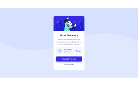
Order summary card using mobile-first workflow
HTML
CSS
0
5
0
Submitted about 2 years ago
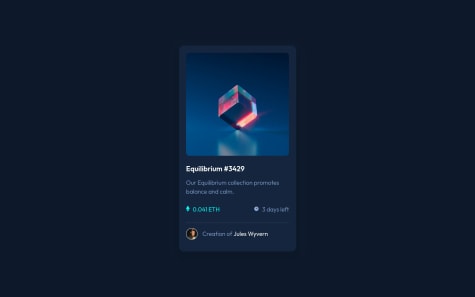
NFT preview card component
HTML
CSS
0
2
0
Submitted about 2 years ago
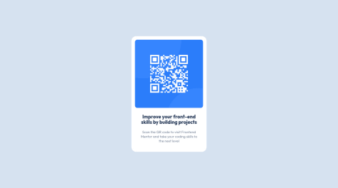
QR code component
HTML
CSS
0
6
0
Submitted about 2 years ago
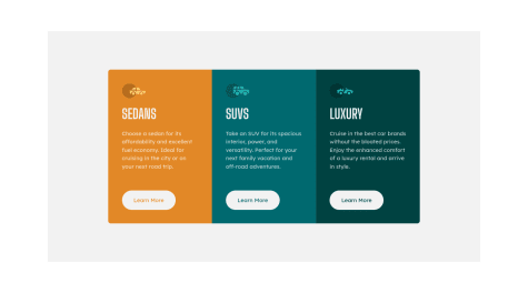
3-column-preview-card-component
HTML
CSS
1
5
0
Submitted about 2 years ago
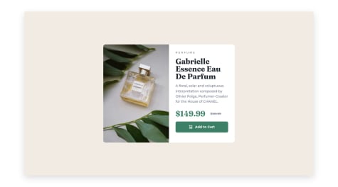
Product review card using CSS SASS
HTML
CSS
0
4
0
