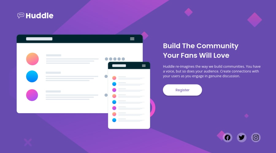
Huddle landing page with single introductory section using CSS Grid
Design comparison
Solution retrospective
Hi everyone! Here is my solution. I used mainly CSS Grid for the layout. I did a few upgrades to the button and social media icons by adding extra effects.
Feel free to leave comments on how I can improve my code. Appreciate your feedback for me. Thank you so much.
Community feedback
- @vanzasetiaPosted about 2 years ago
Hi!
Regarding the social media icons, I prefer the original design. Using the black color for the social media icons while all the other text is white is not appropriate. That's my opinion. I am not a designer. So, feel free to take my suggestion if you want.
Some suggestions:
- Why are you adding
aria-hidden="true"to theimgthat has alternative text? - Logo is an important content of the page. It's not decorative. So, it should not have
aria-hidden="true"attribute. - Also, the alternative text for the logo should be the company name (
alt="Huddle"). Currently, people can think that the site is a website for a Logo company. - Never limit the height of the
bodyelement. It will not allow the users to scroll the page if the page content needs moreheight. You can see the issue by looking at the site on a mobile landscape view. So, my recommendation is to usemin-heightinstead. - Use the
emunit for media queries. It adapts when the users change their font size setting. Here are some references.
I hope this helps!
Marked as helpful1@nt-squaredPosted about 2 years agoHi 👋 Your comment is always helpful, especially regarding accessibility. I feel very grateful for that. Thanks a lot!
0 - Why are you adding
Please log in to post a comment
Log in with GitHubJoin our Discord community
Join thousands of Frontend Mentor community members taking the challenges, sharing resources, helping each other, and chatting about all things front-end!
Join our Discord
