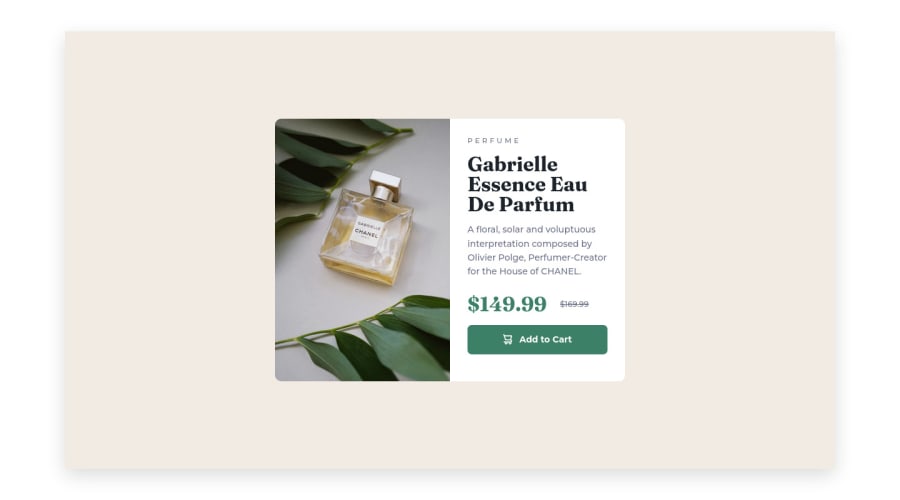
Design comparison
SolutionDesign
Solution retrospective
This is the very first challenge that I deal with, so I was totally confused at the beginning and got messed up from assigning variables to selecting html tag while building the project. I was trying to get the product looking as close to the design as possible.
I have a few questions:
- I am not sure of the area of responsive code, since the requested widths between the two view modes are different significantly. Should I myself choose a larger width for responsiveness between mobile and desktop views?
- I chose to override the default font size of the browser with the requested font size. Is it a good choice?
- Mobile-first or desktop-first workflow? which one is a better approach for the most part?
Appreciate your feedback for me. Thank you so much.
Community feedback
Please log in to post a comment
Log in with GitHubJoin our Discord community
Join thousands of Frontend Mentor community members taking the challenges, sharing resources, helping each other, and chatting about all things front-end!
Join our Discord
