

Design comparison

Solution retrospective
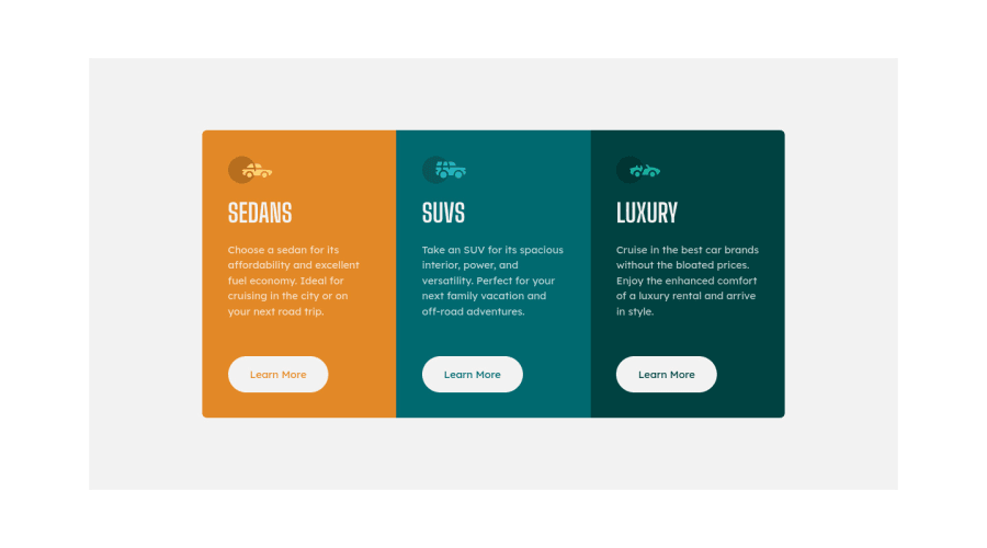
Hi everyone! Here is my solution. Appreciate your feedback for me. Thank you so much.
Community feedback
- @vanzasetiaPosted about 2 years ago
Hi there! 👋
Congratulations on finishing this challenge! 🎉
I recommend setting the gray background color on the
bodyelement instead of on themainelement. Also, there's no need to putmax-width: 1440pxon themainelement. I recommend setting themax-widthto limit the width of the card container.Some more suggestions for improvements.
- I recommend using the
mainelement as the container of the card element. This way, you can remove thedivthat wraps the cards. - For decorative SVGs, add
aria-hidden="true"attribute to thesvg. Doing this will prevent assistive technology such as screen readers to pronounce the decorative icons. - Heading levels must always be in order to give structure to a page. In this case, it's okay to not have
h1. So, swap all theh4withh2. I recommend reading the "How-to: Accessible heading structure - The A11Y Project" article to learn how to use headings correctly. - Always specify the
typeof thebutton. In this case, set the type of them astype="button". It will prevent the button from behaving unexpectedly.
I have three recommended videos. The first one tells how hard HTML is (HTML is not easy). The other two talk about modern CSS techniques and approaches.
- Manuel Matuzović - Lost in Translation - YouTube
- Andy Bell – Be the browser’s mentor, not its micromanager - YouTube
- Stephanie Eeckles - Scaling CSS Layout Beyond Pixels - YouTube
That's it! I hope this helps!
Marked as helpful1@nt-squaredPosted about 2 years ago@vanzasetia Thank you so much for your detailed feedback! :thumbsup:
1 - I recommend using the

Please log in to post a comment
Log in with GitHubJoin our Discord community
Join thousands of Frontend Mentor community members taking the challenges, sharing resources, helping each other, and chatting about all things front-end!
Join our Discord