
@JanWu100

P
Marge C.
@msunjiAll comments
- P@msunji
Heya Jan!
The animation effect you've added is super neat. Well done! 👍
The reason why you're receiving the same response is likely because of the Advice Slip JSON API itself. From the docs: "Note: Advice is cached for 2 seconds. Any repeat-request within 2 seconds will return the same piece of advice."
What you can do instead is try adding
{ cache: 'no-store' }to your fetch request. I've seen this as a suggested solution as well. Hope this helps!Marked as helpful - @deksa89P@msunji
Hiya Dean! Great job! 👍
You're right about it not having to be too complicated. Here's how to simplify things a bit. First off, I noticed you used
id's, you can use classes instead. The logic here is:- Aside from the text colour, your buttons all have the same base style - the same size, padding, etc. You can use the
buttonselector, or make a class that you'll use for all three buttons. (Note: in this explanation, I'll use thebuttonselector instead of a class, but you can definitely have two or more classes for an element). - Set your base styles. You'll also want to set a border that's the same colour as the button's background colour, so something like:
border: 2px solid #fff; - To change the button's colour on hover, instead of setting the background colour for each button, you can do this instead:
button:hover { background: transparent; color: #fff; }- Last but not least, to change the text colour for each button, you'll want to make a class for each button. Maybe something like
button-sedan,button-suv, etc. Then for each class, set the colour accordingly.
That should help reduce/simplify the amount of CSS you've written. Hope you find this helpful!
Marked as helpful - Aside from the text colour, your buttons all have the same base style - the same size, padding, etc. You can use the
- @nottundeednutP@msunji
Hiya! Great job working on this challenge! 👍
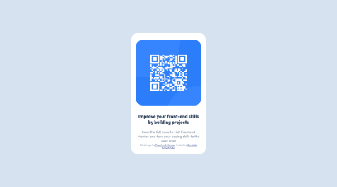
The reason why your QR code component (
<div class="border">) shrinks significantly on smaller screen sizes is because you've set the width to 30%. Here's a suggestion you can try to fix this:.border { // your other CSS code width: 100%; max-width: 320px; margin: 50px 20px; }max-widthmakes it so that your.borderdiv doesn't get any larger than 320px. I also added 20px margins on both the left and right side of your div so there's still a bit of space around it on smaller screens.Hope this helped!
Marked as helpful - @marcoberdianoP@msunji
Heya Marco! I know responsive nav bars aren't always the easiest, so great job on this challenge! 👍
I checked out your code and this is what I've done for the menu.
- Instead of using
checkSizeand theuseEffecthook to toggle your menu, you can use CSS classes. In your media query inNavBar.css, setnav-linkstodisplay: none, but also create another class calledactivewithdisplay: flexas a declaration. Something like this:
  .nav-links {
    // your other CSS declarations
    display: none;
  }
  .active {
    display: flex;
  }
The idea here is that when you click on the hamburger menu icon, you want to toggle some piece of state which should then set or not set the
activeclass.- Add a class to your hamburger icon, then in
NavBar.css, set it todisplay: noneon larger screen sizes anddisplay: blockon smaller screen sizes. This way the hamburger icon only shows up on smaller screens. - In
NavBar.jsx, setshowMenu's default state to false and then make an event handlerhandleMobileMenuthat toggles theshowMenustate value. Then add anonClickevent handler to your hamburger icon div and passhandleMobileMenuto it. It'll look something like this:
const handleMobileMenu = () => { setShowMenu(!showMenu); }; <div className="hamburger" onClick={handleMobileMenu}> // your icon </div>- By the way, I imported
NavLinksintoNavBar.jsxinstead ofNormalMenu, then revised your code, so the end product looks like this (which I'll explain a bit below):
<div> <nav className="nav-container"> <div className="logo"> <img src={logo} alt={logo}></img> </div> <NavLinks showMenu={showMenu} /> <div className="hamburger" onClick={handleMobileMenu}> <img src={iconMenu} alt={iconMenu}></img> </div> </nav> </div>- Pass the value of
showMenuto yourNavLinkscomponent. You'll use this to toggle theactiveclass you made earlier. - In your
NavLinkscomponent, toggle the class name like so:
<div className={`nav-links ${showMenu ? 'active' : ''}`}>
// your code
</div>
This should sort out your issue for the most part, but for positioning and stuff, I'll leave that to you. Sorry this explanation got super long! If it's not very clear and you have any questions, feel free to reach out to me. Hope this helped!
- Instead of using
- @jcovington16P@msunji
Heya Joshua! This solution looks great! 👍
I've got a couple of suggestions, but I'll try to keep em' brief:
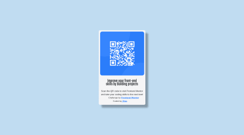
- You can move the
attributiondiv out of thecontainerdiv. Understandably, this'll look a little strange at first because you've gotbodyset todisplay: flex. To sort this out, set theflex-directiontocolumnand theattributiondiv should sit right below your QR container div. Once that's sorted, you could add a bottom margin to yourcontainerdiv to add a tiny bit of spacing between the two elements. - We can clean up your code and sort out the
containerdiv's sizing by setting amax-width. I had a look at the Figma files and it looks to be around320px. Yourcontainerdiv should look something like this:
.container {
  width: 100%;
  // alternatively, you could use vw units, so you could do something like:
  // width: 90vw; (or any value you think looks best) instead
  max-width: 320px;
  padding-bottom: 2.5rem;
  margin-bottom: 1rem;
}
With this set, you can remove the media-query blocks for your
containerdiv. I think that should help clean up your CSS a tiny bit.As for CSS resources, I highly recommend Kevin Powell's Youtube Channel. He's got a whole range of videos about responsive design and getting started with CSS.
Hope this helped!
Marked as helpful - You can move the
- @OthankQP@msunji
Hiya Ryan! Great job solving this challenge. It looks really well done.
About your background colours. I noticed that you had this in
index.css:* { margin: 0; padding: 0; background-color: hsl(28, 62%, 91%); font-family: 'Overpass', sans-serif; }The
*selector selects all your elements, so it's added a cream background colour to all your elements. You'll want to remove thebackground-colordeclaration from that block above and then instead, set yourbodybackground colour to that colour (you can do this in yourindex.cssfile). Once that's sorted, you should be able to remove all the redundantbackground-colordeclarations in your child elements/components.Oh, and another thing. I noticed that you had CSS variables defined in
index.css. You should be able to use this across your other components as well. It might be a little easier to set your colours this way instead of using thehsl()values for each element.Hope this helped! Best of luck with other challenges! 👍
Marked as helpful - @RiscloverP@msunji
Heya!
You can add the
aria-labelattribute (and a value) to your<a>tag and that should sort things out. So it'd probably be something like:<a href="https://github.com/Risclover" target="_blank" aria-label="Github"><i class="devicon-github-original"></i></a>.Everything else looks pretty great, well done! ✨
Marked as helpful - @T-BaranP@msunji
Hiya! Great work solving this challenge! 👍
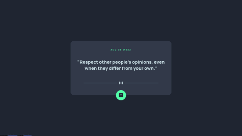
So I think it's a cache issue or something. Anyway, I added:
{ cache: 'no-store' }to yourfetchmethod, so it becomes:const response = await fetch('https://api.adviceslip.com/advice', { cache: 'no-store', });This seems to solve the issue. Hope this helps and best of luck with future challenges!
Marked as helpful - @Deva-MariP@msunji
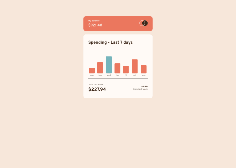
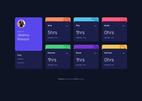
Heya! So I tried tinkering a bit and this is the solution I've come up with:
In your
MainCardcomponent:- I made a new piece of state:
const [timeframe, setTimeframe] = useState('Daily'); - I added a data attribute called
data-timeframeto yourpelement. It takestimeFrame.typeas a value. - For your
clickHandler, I've removed the switch statement block and replaced it with:setTimeframe(event.target.getAttribute('data-timeframe')); - Lastly, to toggle the active class, I've changed it up a bit to this:
className={timeFrame.type === timeframe ? `${styles.active}` : ''}
To sum it up, here's what's changed:
  const [timeframe, setTimeframe] = useState('Daily');

  // I cleaned up your timeframes array a bit and just removed the active property since I didn't need to use it
  const timeFrames = [
    { id: 1, type: 'Daily' },
    { id: 2, type: 'Weekly' },
    { id: 3, type: 'Monthly' },
  ];

  const clickHandler = (event) => {
    const clickedTimeframe = event.target.innerText.toLowerCase();
    setTimeframe(event.target.getAttribute('data-timeframe'));
    props.onChangeTimeframe(clickedTimeframe);
  };
and
  <p
    onClick={clickHandler.bind(this)}
    key={timeFrame.id}
    data-timeframe={timeFrame.type}
    className={timeFrame.type === timeframe ? `${styles.active}` : ''}
  >
    {timeFrame.type}
  </p>
Not entirely sure if this is the most optimal way to solve this, but it's a start. Hope you find it helpful! By the way, your solution looks great! 👍
Marked as helpful - I made a new piece of state:
- @msi117P@msunji
Heya! Great job solving this challenge 👍
A couple of suggestions, but I'll try to keep this short:
- If I'm being honest, your CSS is a little hard to read through 😅. I would suggest using something like the BEM Method to organise and structure your code.
- You may want to remove the default styling for
ol,ulelements. Set their margin and padding to 0. After this, you can remove the left margin from yourh6elements. This should help line up the list elements with theh6headings. - You have some redundant/repeated code that you may want to simplify or clean up. For instance, you have two declaration blocks for your
aelement. For theasideelement, you can removeheight: 25%, and set top and bottom padding instead. Once that's sorted, consider removing thestartedclass from the button in yourasideelement. - For responsive CSS best practices, you can try using a mobile-first workflow. Kevin Powell does a lot of videos about responsive CSS, so you may want to start there.
Hope this helped! Best of luck with future challenges!
Marked as helpful - @carlosngvP@msunji
Heya! Great work finishing this challenge. 👍
A few suggestions:
- You can combine your main stylesheet (
main.css) and your stylesheet with media queries (media-queries.css) into one stylesheet. That way you only make one request to the server. - Style-wise, I think the font weights you've chosen are pretty close to the challenge prompt. However, if you'd like, you can increase the line height for your paragraphs in each "card". That way the lines aren't so squished together.
- As for font sizing, remember that the browser's default font size is 16px. So for your paragraphs, since you've set them to
font-size: 0.6rem, the text ends up being about 9.6px. This can be a little difficult to read on smaller screens.
Hope this helped a bit and best of luck with future challenges!
Marked as helpful - You can combine your main stylesheet (
- @ItachidorriP@msunji
Hiya! The finished product looks great by the way, so well done! 👍
I do have one suggestion for you though. Instead of using float and clear, I recommend you use flexbox instead. I think for the smaller parts of this project that you've used float on, it's fine. But as you start working on larger projects, you may want to learn more about things like flexbox and/or CSS Grid. Hope this was helpful!
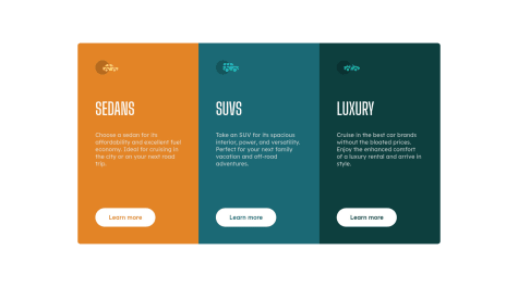
- @CTDckP@msunji
Heya! Great job finishing this project 👍
Reading documentation isn't always the easiest, and I totally get that. But I think you're already moving in the right direction by putting what you've read into practice with this project. I guess all I can say is that it'll take a bit of time, a bit of patience, and sometimes a lot of looking things up on Google and Stack Overflow 😅 Don't worry about it too much if you don't get it the first time around.
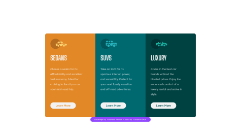
Now about the corners. It seems like Bootstrap's Card component comes with rounded corners out of the box. You'll want to change it up a bit with the
rounded-0utility class to remove all the rounded corners. Then, instyles.css, you're going to need to do some custom code and media queries to set the rounded corners depending on their location (and screen size). You'll end up with something like this, for instance:.sedan { border-radius: 12px 12px 0 0; } @media (min-width: 600px) { .sedan { border-radius: 12px 0 0 12px; } }I'm not super well versed in Bootstrap, so there might be other solutions out there, but I hope this helped regardless!
Marked as helpful - @ojninja16P@msunji
Hey there! Great job solving this challenge 👏
Instead of using multiple
<br />tags to create space between elements, you could try setting a bottom margin instead. It'll clean up your code a bit and you'll have a bit more control over the amount of spacing you want between elements.Hope this suggestion helps and good luck with the next challenges!
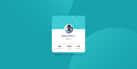
Marked as helpful - @Finney06P@msunji
Hi! Nice job solving this challenge! 👍
You're moving in the right direction with regards to positioning the background SVG images. You can add a numeric value in addition to keyword values like
right,top,bottom, etc. You'll end up with something like this:background-position: left 50vw top 40vh, right 46vw bottom 50vh;. Try playing around with the numeric values until you get it to look the way you want it to look.Also, it might seem a little counterintuitive to see the bottom image aligned to left and top, and the top image aligned right and bottom. But give it a try and you'll see that it should work fine this way on smaller screens too.
Hope this suggestion helped!
Marked as helpful - @ehoda9P@msunji
Great job solving this challenge! 👍
About your question, you need to iterate over
data. You can use themap()method to go over each element in thedataarray. My solution might require reworking your HTML and CSS a bit, but here's what you could try out:- In
index.html, make adivthat contains all the cards. You will be modifying the content of thisdivin yourapp.jswithinnerHTML. - In
app.js, you'll want tomap()through your data and save the results to a variable. After which,join()the results and then set the variable as the innerHTML.
Here's what mapping through your data would look like:
    let markup = data.map((category) => {
        let { title, timeframes } =  category; // You can use object destructuring here
        // Use template strings below so you can set the category title (Work, Play, etc) and the timeframes as well.
        return `
            <div class="card">
                <h2 class="card__title">${title}</h2>
                // you can type out the rest of your code for your card
            </h2>
        `
    }).join('');
    cards.innerHTML = markup;
You can refactor things further and make a function so you don't have to keep rewriting the
map()part for each timeframe.It's a bit of a long suggestion, but I hope it helps!
Marked as helpful - In
- @kaiohnrP@msunji
If you're trying to save links you've shortened and you want this data to persist even after you've refreshed the page, you can use the localStorage property. It basically lets you save key/value pairs in the browser, and the data should persist even after you've refreshed the page or closed the tab/window. You can give it a try and see how it goes. Hope it helps!