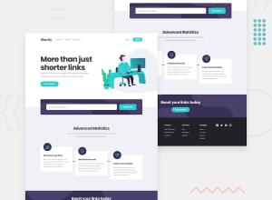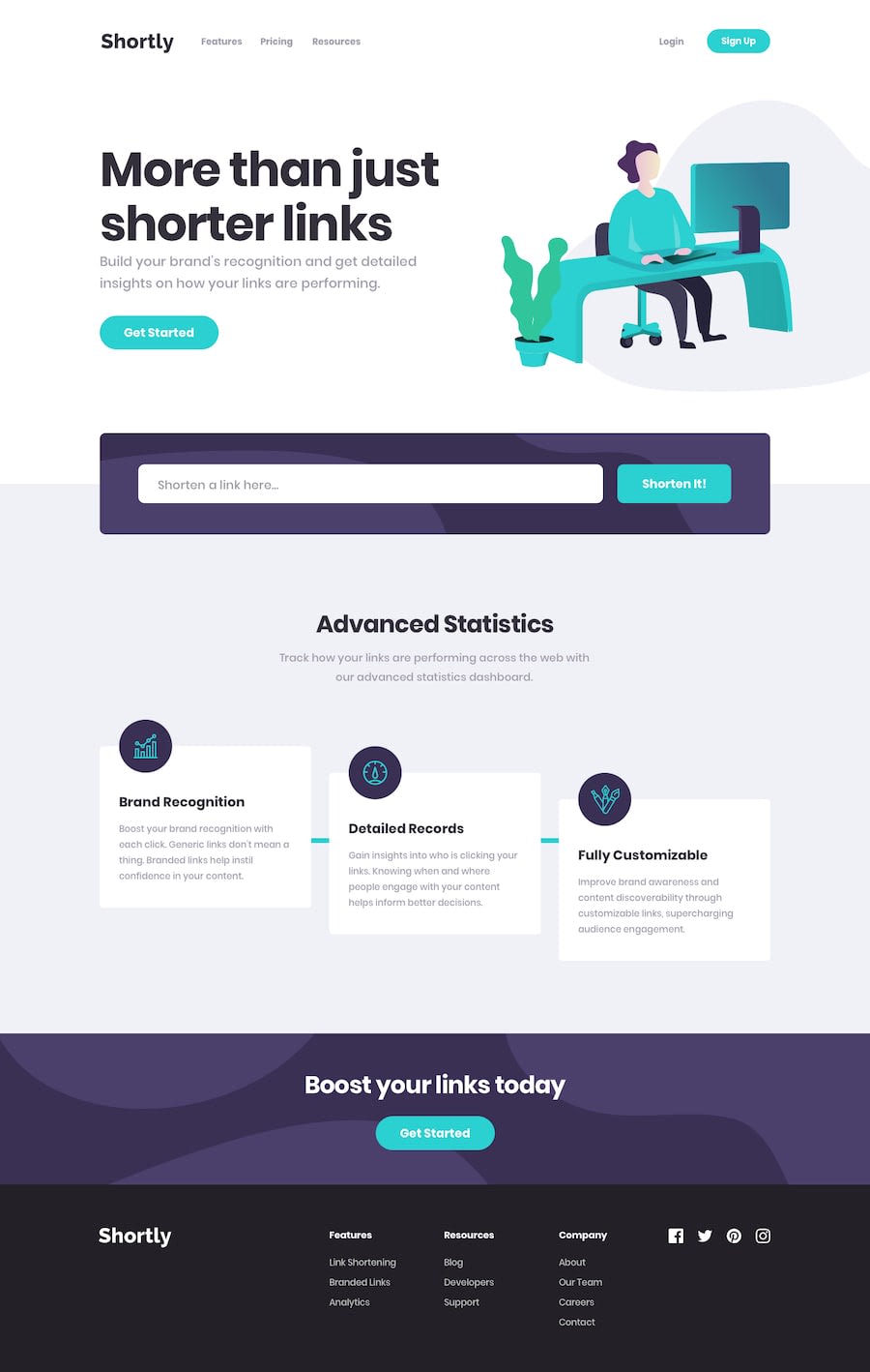
Design comparison
SolutionDesign
Solution retrospective
Do you think i have added unnecessary CSS? Suggest some best practices to make page more responsive?
Community feedback
- @msunjiPosted over 2 years ago
Heya! Great job solving this challenge 👍
A couple of suggestions, but I'll try to keep this short:
- If I'm being honest, your CSS is a little hard to read through 😅. I would suggest using something like the BEM Method to organise and structure your code.
- You may want to remove the default styling for
ol,ulelements. Set their margin and padding to 0. After this, you can remove the left margin from yourh6elements. This should help line up the list elements with theh6headings. - You have some redundant/repeated code that you may want to simplify or clean up. For instance, you have two declaration blocks for your
aelement. For theasideelement, you can removeheight: 25%, and set top and bottom padding instead. Once that's sorted, consider removing thestartedclass from the button in yourasideelement. - For responsive CSS best practices, you can try using a mobile-first workflow. Kevin Powell does a lot of videos about responsive CSS, so you may want to start there.
Hope this helped! Best of luck with future challenges!
Marked as helpful1@msi117Posted over 2 years ago@msunji Thanks for your honest feedback. I really appreciate. This tutorial by Kevin Powell looks great. Thanks again.
0
Please log in to post a comment
Log in with GitHubJoin our Discord community
Join thousands of Frontend Mentor community members taking the challenges, sharing resources, helping each other, and chatting about all things front-end!
Join our Discord
