


@JanWu100Submitted almost 3 years ago
Latest solutions
React solution - styled-components, flexbox, grid
#react#styled-componentsPSubmitted almost 3 years agoReact solution - styled-components, flexbox, grid, framer motion
#react#styled-componentsPSubmitted almost 3 years agoReact solution with styled-components, CSS Grid, and flexbox
#react#parcelPSubmitted over 3 years ago
Latest comments
- P@msunjiPosted almost 3 years ago
Heya Jan!
The animation effect you've added is super neat. Well done! 👍
The reason why you're receiving the same response is likely because of the Advice Slip JSON API itself. From the docs: "Note: Advice is cached for 2 seconds. Any repeat-request within 2 seconds will return the same piece of advice."
What you can do instead is try adding
{ cache: 'no-store' }to your fetch request. I've seen this as a suggested solution as well. Hope this helps!Marked as helpful0 - @deksa89Submitted almost 3 years agoP@msunjiPosted almost 3 years ago
Hiya Dean! Great job! 👍
You're right about it not having to be too complicated. Here's how to simplify things a bit. First off, I noticed you used
id's, you can use classes instead. The logic here is:- Aside from the text colour, your buttons all have the same base style - the same size, padding, etc. You can use the
buttonselector, or make a class that you'll use for all three buttons. (Note: in this explanation, I'll use thebuttonselector instead of a class, but you can definitely have two or more classes for an element). - Set your base styles. You'll also want to set a border that's the same colour as the button's background colour, so something like:
border: 2px solid #fff; - To change the button's colour on hover, instead of setting the background colour for each button, you can do this instead:
button:hover { background: transparent; color: #fff; }- Last but not least, to change the text colour for each button, you'll want to make a class for each button. Maybe something like
button-sedan,button-suv, etc. Then for each class, set the colour accordingly.
That should help reduce/simplify the amount of CSS you've written. Hope you find this helpful!
Marked as helpful1 - Aside from the text colour, your buttons all have the same base style - the same size, padding, etc. You can use the
- @nottundeednutSubmitted almost 3 years agoP@msunjiPosted almost 3 years ago
Hiya! Great job working on this challenge! 👍
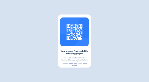
The reason why your QR code component (
<div class="border">) shrinks significantly on smaller screen sizes is because you've set the width to 30%. Here's a suggestion you can try to fix this:.border { // your other CSS code width: 100%; max-width: 320px; margin: 50px 20px; }max-widthmakes it so that your.borderdiv doesn't get any larger than 320px. I also added 20px margins on both the left and right side of your div so there's still a bit of space around it on smaller screens.Hope this helped!
Marked as helpful2 - @marcoberdianoSubmitted almost 3 years agoP@msunjiPosted almost 3 years ago
Heya Marco! I know responsive nav bars aren't always the easiest, so great job on this challenge! 👍
I checked out your code and this is what I've done for the menu.
- Instead of using
checkSizeand theuseEffecthook to toggle your menu, you can use CSS classes. In your media query inNavBar.css, setnav-linkstodisplay: none, but also create another class calledactivewithdisplay: flexas a declaration. Something like this:
  .nav-links {
    // your other CSS declarations
    display: none;
  }
  .active {
    display: flex;
  }
The idea here is that when you click on the hamburger menu icon, you want to toggle some piece of state which should then set or not set the
activeclass.- Add a class to your hamburger icon, then in
NavBar.css, set it todisplay: noneon larger screen sizes anddisplay: blockon smaller screen sizes. This way the hamburger icon only shows up on smaller screens. - In
NavBar.jsx, setshowMenu's default state to false and then make an event handlerhandleMobileMenuthat toggles theshowMenustate value. Then add anonClickevent handler to your hamburger icon div and passhandleMobileMenuto it. It'll look something like this:
const handleMobileMenu = () => { setShowMenu(!showMenu); }; <div className="hamburger" onClick={handleMobileMenu}> // your icon </div>- By the way, I imported
NavLinksintoNavBar.jsxinstead ofNormalMenu, then revised your code, so the end product looks like this (which I'll explain a bit below):
<div> <nav className="nav-container"> <div className="logo"> <img src={logo} alt={logo}></img> </div> <NavLinks showMenu={showMenu} /> <div className="hamburger" onClick={handleMobileMenu}> <img src={iconMenu} alt={iconMenu}></img> </div> </nav> </div>- Pass the value of
showMenuto yourNavLinkscomponent. You'll use this to toggle theactiveclass you made earlier. - In your
NavLinkscomponent, toggle the class name like so:
<div className={`nav-links ${showMenu ? 'active' : ''}`}>
// your code
</div>
This should sort out your issue for the most part, but for positioning and stuff, I'll leave that to you. Sorry this explanation got super long! If it's not very clear and you have any questions, feel free to reach out to me. Hope this helped!
0 - Instead of using
- @jcovington16Submitted almost 3 years agoP@msunjiPosted almost 3 years ago
Heya Joshua! This solution looks great! 👍
I've got a couple of suggestions, but I'll try to keep em' brief:
- You can move the
attributiondiv out of thecontainerdiv. Understandably, this'll look a little strange at first because you've gotbodyset todisplay: flex. To sort this out, set theflex-directiontocolumnand theattributiondiv should sit right below your QR container div. Once that's sorted, you could add a bottom margin to yourcontainerdiv to add a tiny bit of spacing between the two elements. - We can clean up your code and sort out the
containerdiv's sizing by setting amax-width. I had a look at the Figma files and it looks to be around320px. Yourcontainerdiv should look something like this:
.container {
  width: 100%;
  // alternatively, you could use vw units, so you could do something like:
  // width: 90vw; (or any value you think looks best) instead
  max-width: 320px;
  padding-bottom: 2.5rem;
  margin-bottom: 1rem;
}
With this set, you can remove the media-query blocks for your
containerdiv. I think that should help clean up your CSS a tiny bit.As for CSS resources, I highly recommend Kevin Powell's Youtube Channel. He's got a whole range of videos about responsive design and getting started with CSS.
Hope this helped!
Marked as helpful1 - You can move the
- @OthankQSubmitted almost 3 years agoP@msunjiPosted almost 3 years ago
Hiya Ryan! Great job solving this challenge. It looks really well done.
About your background colours. I noticed that you had this in
index.css:* { margin: 0; padding: 0; background-color: hsl(28, 62%, 91%); font-family: 'Overpass', sans-serif; }The
*selector selects all your elements, so it's added a cream background colour to all your elements. You'll want to remove thebackground-colordeclaration from that block above and then instead, set yourbodybackground colour to that colour (you can do this in yourindex.cssfile). Once that's sorted, you should be able to remove all the redundantbackground-colordeclarations in your child elements/components.Oh, and another thing. I noticed that you had CSS variables defined in
index.css. You should be able to use this across your other components as well. It might be a little easier to set your colours this way instead of using thehsl()values for each element.Hope this helped! Best of luck with other challenges! 👍
Marked as helpful0