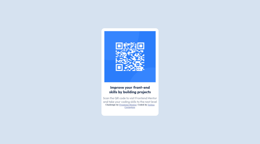
Design comparison
Solution retrospective
What I found difficult while building the project was the css portion. The spacing was a little hard for me to get accurate.
Other than the css, I was pretty aware of what to do with my code.
I would love to know best practices when ensuring my components are in their appropriate divs and I would like to have some resources that can help me with my css knowledge.
Please log in to post a comment
Log in with GitHubCommunity feedback
- P@msunji
Heya Joshua! This solution looks great! 👍
I've got a couple of suggestions, but I'll try to keep em' brief:
- You can move the
attributiondiv out of thecontainerdiv. Understandably, this'll look a little strange at first because you've gotbodyset todisplay: flex. To sort this out, set theflex-directiontocolumnand theattributiondiv should sit right below your QR container div. Once that's sorted, you could add a bottom margin to yourcontainerdiv to add a tiny bit of spacing between the two elements. - We can clean up your code and sort out the
containerdiv's sizing by setting amax-width. I had a look at the Figma files and it looks to be around320px. Yourcontainerdiv should look something like this:
.container {
  width: 100%;
  // alternatively, you could use vw units, so you could do something like:
  // width: 90vw; (or any value you think looks best) instead
  max-width: 320px;
  padding-bottom: 2.5rem;
  margin-bottom: 1rem;
}
With this set, you can remove the media-query blocks for your
containerdiv. I think that should help clean up your CSS a tiny bit.As for CSS resources, I highly recommend Kevin Powell's Youtube Channel. He's got a whole range of videos about responsive design and getting started with CSS.
Hope this helped!
Marked as helpful - You can move the
Join our Discord community
Join thousands of Frontend Mentor community members taking the challenges, sharing resources, helping each other, and chatting about all things front-end!
Join our Discord
