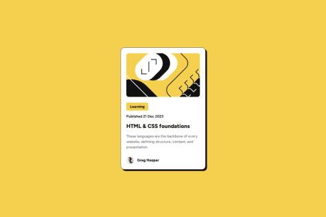
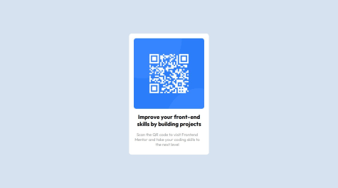
The stuff I learned from my previous Challenge such as the use of Flex box. This time, I started following the mobile first design.
What challenges did you encounter, and how did you overcome them?The pseudo elements can be challenging to style. I took time in aligning list styles and found out about the use of list-style-position.
What specific areas of your project would you like help with?Would appreciate any feed back on what I could have done better.


