Design comparison
Solution retrospective
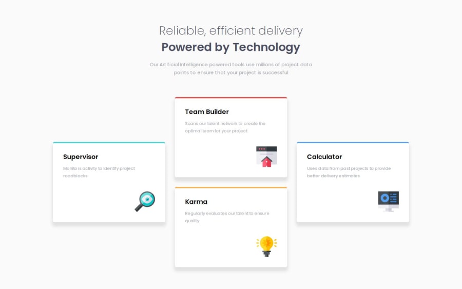
I tried to match to design as close as I could....
What challenges did you encounter, and how did you overcome them?I normally use felxbox for positioning but plan to use grid more. I made a grid with three columns and as there were 4 cards it automatically added a row which I didn't want. As a solution I wrapped the middle two cards in a div which seemed to solve the problem as it pushed the two middle cards into the middle column and got rid of the row.
What specific areas of your project would you like help with?Any feedback / constructive criticism always welcome...
Community feedback
- P@mickoymousePosted 12 months ago
This is really good. Visually this is way way better than what I have. I only skimmed through the code but I noticed you're using 2 H1 headings which semantically, I am pretty sure shouldn't not happen.
I'll study your approach more once I have more time.
Keep up the good work!
0@WB52Posted 12 months ago@mickoymouse
Thanks for your comment and feedback, much appreciated...
Originally I did have both heading text in an h1 with a span added like...
<h1><span>Reliable, efficient delivery</span> Powered by Technology</h1>I put the top line in a span so I could target it's font weight, though I had problems creating the space I wanted between the lines even with line-height. It wasn't too bad and probably being overly fussy, but it just bugged me so I went for x 2 h1's so I could control the space between them better.
I originally thought the same as you, that it's not good practice using 2 h1's, I did some research and it has mixed opinions. Some said avoid and others said it's ok as long as they are not over used. That said I'm going to avoid it in future now you mentioned it... :-)
0P@mickoymousePosted 12 months ago@WB52 yeah. From what I’ve gathered, it looks like we should only have 1 H1 in a page as a general rule of thumb. That along with not jumping heading levels.
That being said, stuff like those are semantics which will be more important depending on what website we are building. (Seo, accessibility, screenreaders)
Anyhow, good luck with future challenges! Let’s both learn more!
Marked as helpful1
Please log in to post a comment
Log in with GitHubJoin our Discord community
Join thousands of Frontend Mentor community members taking the challenges, sharing resources, helping each other, and chatting about all things front-end!
Join our Discord
