Submitted 12 months ago
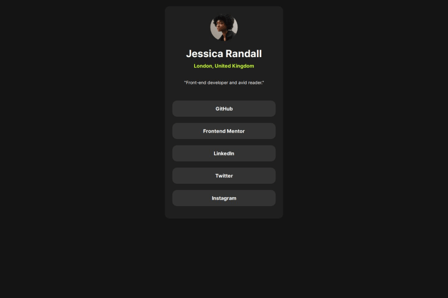
Responsive Socila link profile card using css flex
@suresh298877
Design comparison
SolutionDesign
Solution retrospective
What are you most proud of, and what would you do differently next time?
i'm confident on flex box now and from next time i'll divide whole taks into divisions and try to complete it.
What challenges did you encounter, and how did you overcome them?nothing
What specific areas of your project would you like help with?nothing
Community feedback
- P@mickoymousePosted 12 months ago
Good work. Few feedbacks:
- Looks liked cursor pointer on li was missed.
- Card was not centered on the screen like on the UI design.
- I am also still learning about typography but I don't think you should jump headings like that. If you really need to use a next level of heading, you should do so in increments. I.e., h1 -> h2.
Aside from that, it looks good! Great job!
Marked as helpful0
Please log in to post a comment
Log in with GitHubJoin our Discord community
Join thousands of Frontend Mentor community members taking the challenges, sharing resources, helping each other, and chatting about all things front-end!
Join our Discord
