Submitted over 1 year ago
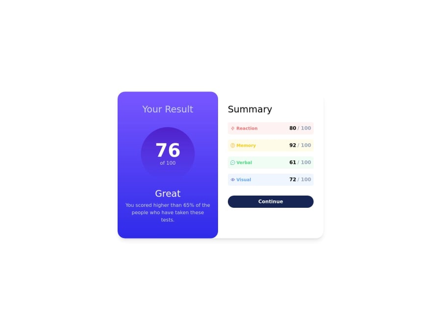
Results Summary using Tailwind CSS
P
@mickoymouse
Design comparison
SolutionDesign
Solution retrospective
After a long hiatus I am back with practicing and exploring front end development.
I've skip a lot of stuff in this challenge (i.e., fonts) as my main focus here is to explore tailwind css. I will be using frontend challenges like these to learn and apply what I am learning along the way on the usage of tailwind css.
Feedbacks are greatly appreciated as I am really planning to start using tailwind css in most of my upcoming projects as I am currently trying to learn next.js, shadcn ui, and tailwind css.
Thank you!
Community feedback
Please log in to post a comment
Log in with GitHubJoin our Discord community
Join thousands of Frontend Mentor community members taking the challenges, sharing resources, helping each other, and chatting about all things front-end!
Join our Discord
